Free PL-300 Practice Test Questions and Answers (2026)

View Mode
Q: 1
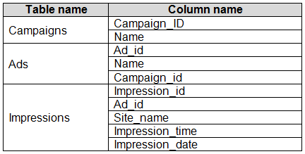
You have the tables shown in the following table. Microsoft PL-300 question The Impressions table contains approximately 30 million records per month. You need to create an ad analytics system to meet the following requirements: Present ad impression counts for the day, campaign, and Site_name. The analytics for the last year are required. Minimize the data model size. Which two actions should you perform? Each correct answer presents part of the solution. NOTE: Each correct selection is worth one point.
Options
33 comments in the community discussion
1
Option B and C for sure. Creating one-to-many relationships (B) keeps the data clean and you can count impressions with a lightweight measure (C), which won’t bulk up the model. No need for a calculated table here I think, unless I missed something. Agree?
1
B tbh, calculated tables like D would just make the data model bigger and aren't needed. Setting up one-to-many relationships (B) lets you slice and dice by ad, site, and date, and a measure using COUNTROWS (C) gives you counts without loading tons more data. Saw a similar question in practice sets. Anyone see a legit
Q: 2
In Power BI Desktop, you are building a sales report that contains two tables. Both tables have row- level security (RLS) configured. You need to create a relationship between the tables. The solution must ensure that bidirectional cross-filtering honors the RLS settings. What should you do?
Options
21 comments in the community discussion
5
Option D is the way to go, since you need an active relationship and the "Apply security filter in both directions" box ticked for bidirectional RLS to actually work. If you only set the relationship active without that security filter setting, cross-filtering won't enforce RLS from both tables. Pretty sure about this
2
D imo. Only an active relationship with 'Apply security filter in both directions' will actually carry RLS across both tables for bidirectional access. The others either miss the active piece or the right filter setting. Open to corrections but pretty sure.
Q: 3
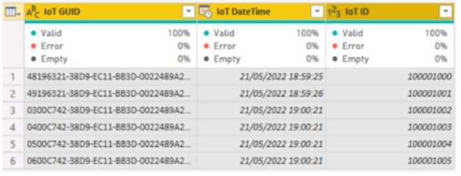
Note: This question is part of a series of questions that present the same scenario. Each question in the series contains a unique solution that might meet the stated goals. Some question sets might have more than one correct solution, while others might not have a correct solution. After you answer a question in this section, you will NOT be able to return to it. As a result, these questions will not appear in the review screen. From Power Query Editor, you profile the data shown in the following exhibit. Microsoft PL-300 question The IOT ID columns are unique to each row in query. You need to analyze 10T events by the hour and day of the year. The solution must improve dataset performance. Solution: You change the IOT DateTime column to the Date data type. Does this meet the goal?
Options
29 comments in the community discussion
6
Option B I remember seeing this in the official docs and practice sets-changing to Date helps with performance but it loses the hour detail, so doesn't fit the analysis goal here.
4
B. I saw a similar question on a practice exam and it's the same logic here.
Q: 4

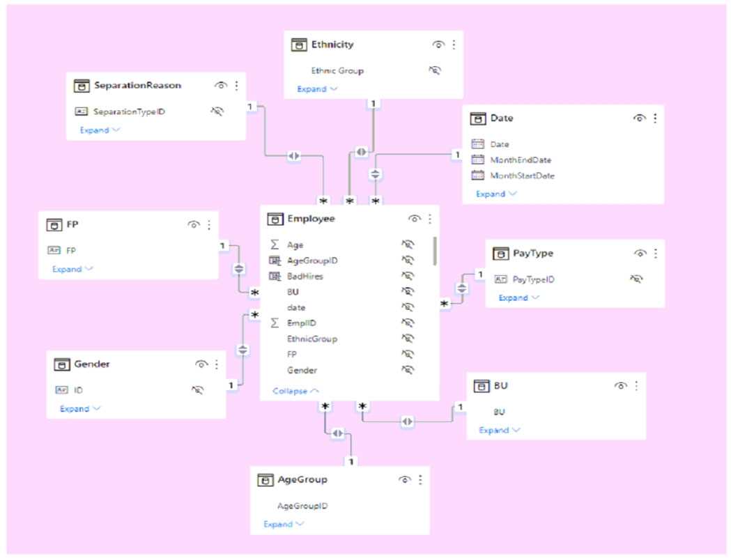
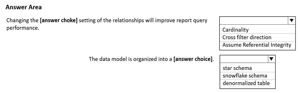
HOTSPOT You have a Power BI imported dataset that contains the data model shown in the following exhibit. Microsoft PL-300 question Use the drop-down menus to select the answer choice that completes each statement based on the information presented in the graphic. NOTE: Each correct selection is worth one point. Microsoft PL-300 question
Your Answer
27 comments in the community discussion
6
Would switching to bidirectional filtering help with flexibility here or just add complexity? Curious what others think since the model looks like a classic star schema layout but not sure if direction needs to change unless the scenario calls for it.
6
Nah, it's not snowflake here. Cross filter direction and star schema for this one.
Q: 5

You need to create a visual that compares profit across 10 product categories fora selected quarter.


What is the best visual to use to achieve the goal?


Options
29 comments in the community discussion
9
Clustered column chart, had something like this in a mock, fits the comparison across categories well.
6
If the product category labels are unusually long, I'd actually go with clustered bar chart instead since it keeps everything readable. Otherwise clustered column chart is probably what they're after here.
Q: 6
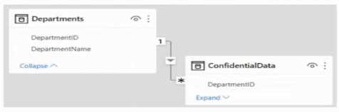
You have the Power Bl model shown in the following exhibit. Microsoft PL-300 question There are four departments in the Departments table. You need to ensure that users can see the data of their respective department only. What should you do?
Options
32 comments in the community discussion
1
C or A? In practice exams and the official guide, row-level security (RLS) like A comes up when you need to actually restrict data by department, but filtering with DAX or slicers is common for just UI filtering. Not totally sure without seeing how strict the requirement is. Worth checking Microsoft docs or labs for
1
Had something like this in a mock, it's A for real data security per department.
Q: 7

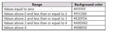
DRAG DROP You have a Power Bl report that contains a table visual with a measure named Revenue. The Revenue measure returns values within a range of 0 to S. You need to formal the visual so that the Revenue column displays a specific background color based on the value range shown in the following table. Microsoft PL-300 question Which three actions should you perform in sequence in Power B) Desktop? To answer, move the appropriate actions from the list of actions to the answer area and arrange them in the correct order. Microsoft PL-300 question

Drag & Drop
22 comments in the community discussion
5
Yeah that's the right steps: open Background color dialog, set Format style to Rules, then add and configure rules for each range. Using Rules is key since you want color based on specific value bands. Pretty sure on this one but open to corrections.
5
Open Background color dialog, set Format style to Rules, then configure rules per range. Super clear sequence.
Q: 8

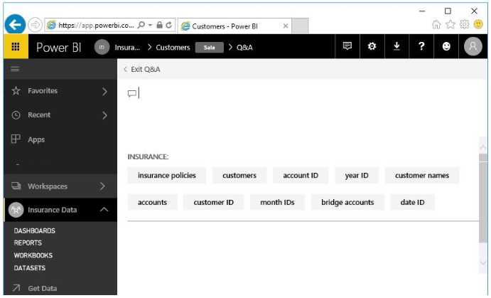
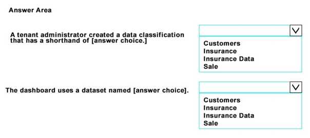
HOTSPOT You open powerbi.com as shown in the following exhibit. Microsoft PL-300 question Use the drop-down menus to select the answer choice that completes each statement based on the information presented in the graphic. NOTE: Each correct selection is worth one point. Microsoft PL-300 question
Your Answer
33 comments in the community discussion
6
Not INSURANCE for both, that's a classic trap. SALE for the tag, INSURANCE for Q&A dataset.
6
Which field in the UI actually marks the classification tag, is it always shown beside the report name?
Q: 9

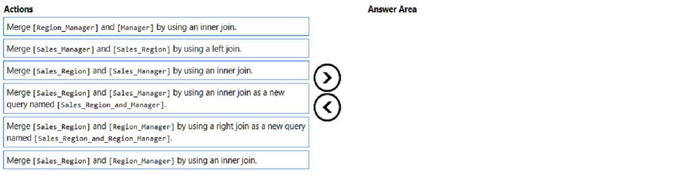
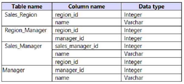
DRAG DROP You create a data model in Power BI. Report developers and users provide feedback that the data model is too complex. The model contains the following tables. Microsoft PL-300 question The model has the following relationships: *There is a one-to-one relationship between Sales_Region and Region_Manager. *There are more records in Manager than in Region_Manager, but every record in Region_Manager has a corresponding record in Manager. *There are more records in Sales_Manager than in Sales_Region, but every record in Sales_Region has a corresponding record in Sales_Manager. You need to denormalize the model into a single table. Only managers who are associated to a sales region must be included in the reports. Which three actions should you perform in sequence? To answer, move the appropriate actions from the list of actions to the answer area and arrange them in the correct order. NOTE: More than one order of answer choices is correct. You will receive credit for any of the correct orders you select. Microsoft PL-300 question

Drag & Drop
29 comments in the community discussion
6
Makes sense to start with Sales_Region and Region_Manager (right join, new query), then inner join in Manager, finish with Sales_Region and Sales_Manager (inner join). Keeps only managers tied to a sales region just like the scenario asks. If I'm off let me know but that's how I've seen it done.
5
Sales_Region and Region_Manager right join, then Region_Manager to Manager inner join, then Sales_Region to Sales_Manager inner join.
Q: 10

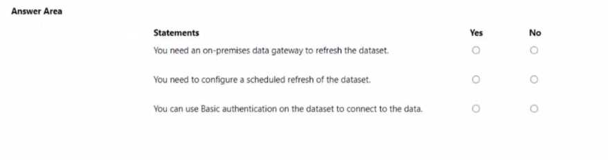
HOTSPOT You publish the dataset to powerbi.com. For each of the following statements, select Yes if the statement is true. Otherwise, select No. NOTE: Each correct selection is worth one point. Microsoft PL-300 question

Your Answer
30 comments in the community discussion
6
NO, YES, YES. That last "can use basic authentication" bit is tricky-a lot of folks think it's not allowed, but the statement just asks if it's possible, not required. Saw similar wording on a practice set. Open to debate though.
6
NO, YES, YES. Basic authentication is still valid for lots of connectors, not just OData. Pretty sure that's what they're after here.
Q: 11

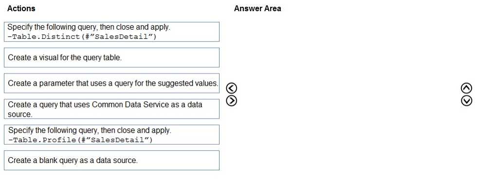
DRAG DROP You are modeling data in table named SalesDetail by using Microsoft Power Bl. You need to provide end users with access to the summary statistics about the SalesDetail dat a. The users require insights on the completeness of the data and the value distributions. Which three actions should you perform in sequence? To answer, move the appropriate actions from the list of actions to the answer area and arrange them in the correct order. Microsoft PL-300 question
Drag & Drop
6 comments in the community discussion
5
Create a blank query, then use Table.Profile for profiling, finally build a visual. Pretty sure this order matches Power Query workflow.
3
Blank query, Table.Profile, then create a visual for the output. Distinct's a trap since they're asking for data completeness and distribution, not unique values. Pretty sure that's what similar exam questions want.
Q: 12
Which two types of visualizations can be used in the balance sheet reports to meet the reporting goals? Each correct answer presents part of the solution. NOTE: Each correct selection is worth one point.
Options
5 comments in the community discussion
1
Official docs and practice exams both cover these visual types. Anyone else see A and E together in recent practice sets?
1
Its A and E. Line charts work well for trends over time, especially for something like balances by quarter. Ribbon charts are great for showing movements and ranks across categories over multiple periods. I think these fit balance sheet reporting best, agree?
Q: 13
You have an on-premises data gateway. You need to reduce the amount of data sent through the gateway by semantic models that run in Import storage mode. Solution: You decrease the dashboard cache update frequency. Does this meet the goat?
Options
10 comments in the community discussion
6
B. because with Import mode the gateway is only used when refreshing data from the source, not when updating dashboard cache in Power BI service. Adjusting cache frequency just affects how often users see updated visuals, but doesn't trigger new pulls from on-prem via the gateway. Pretty sure this is how it's tested in
1
I don’t think it’s B. A, since dashboard cache frequency changes could impact how often tiles are refreshed, which I thought would affect gateway load too (at least for some scenarios). Maybe I’m missing a nuance with Import mode here.
Q: 14

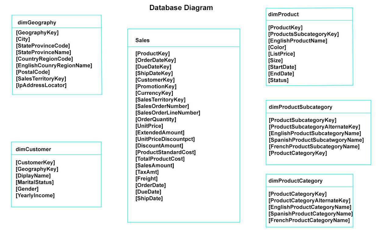
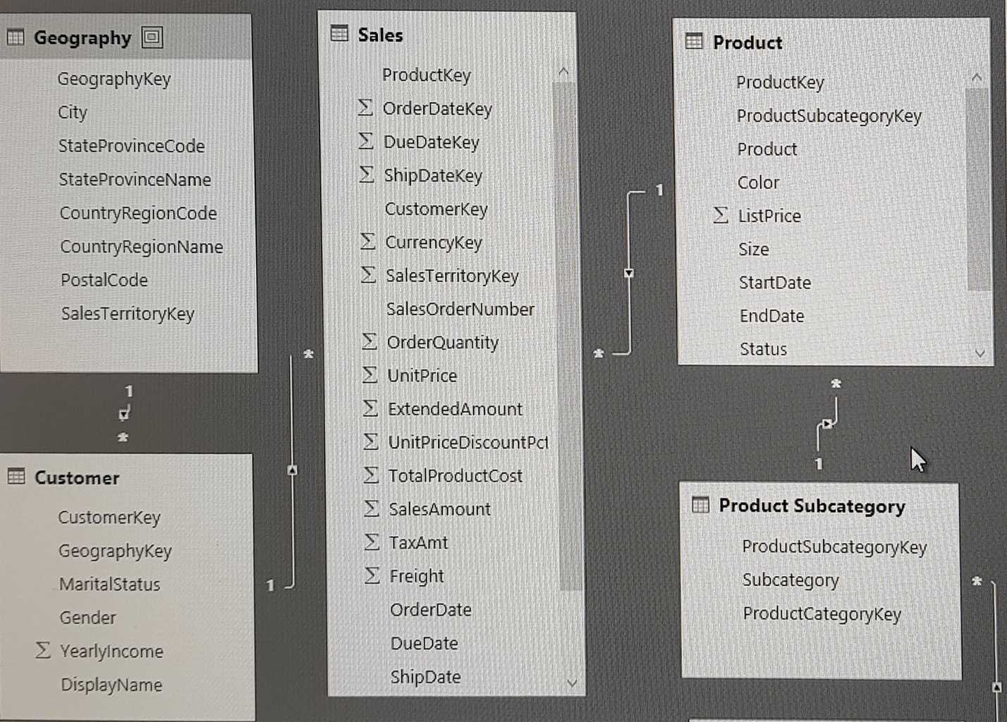
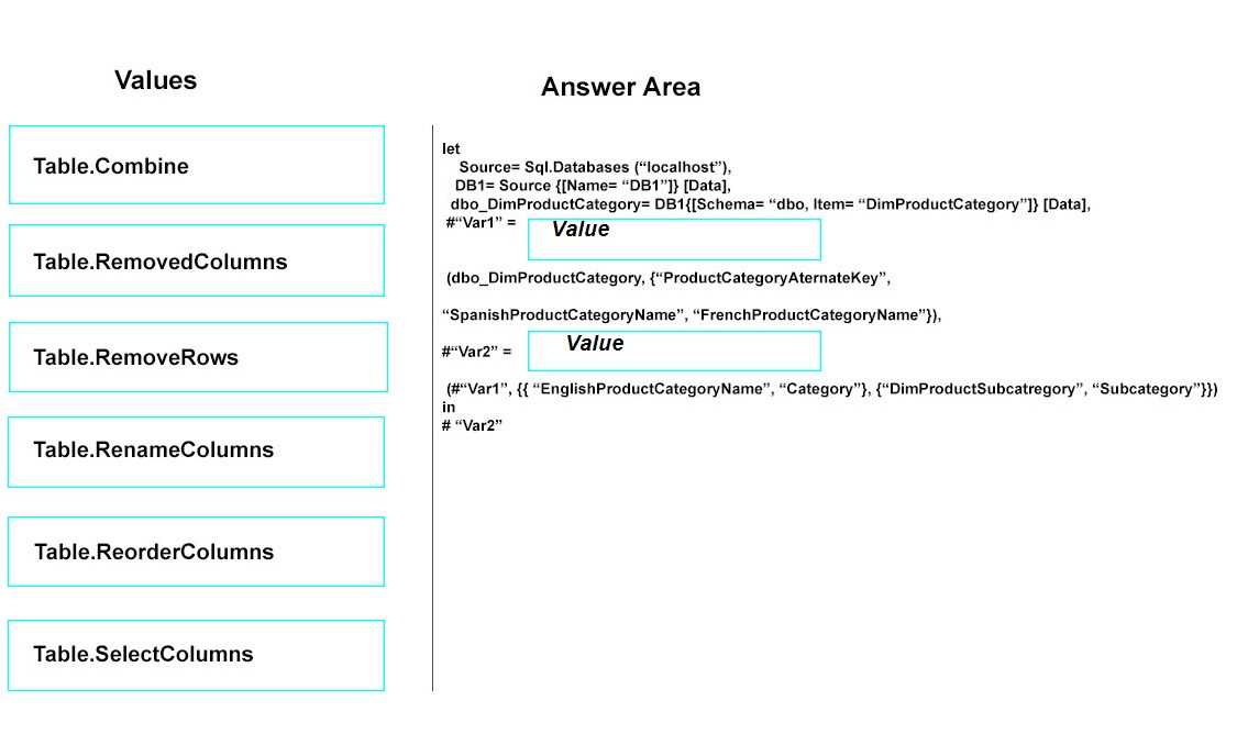
DRAG DROP Note: This question is a part of a series of questions that present the same scenario. For your convenience, the scenario is repeated in each question. Each question presents a different goal and answer choices, but the text of the scenario is exactly the same in each question in this series. Start of repeated scenario You have a Microsoft SQL Server database that has the tables shown in the Database Diagram exhibit. (Click the Exhibit.) Microsoft PL-300 question You plan to develop a Power BI model as shown in the Power BI Model exhibit. (Click the Exhibit). Microsoft PL-300 question You plan to use Power BI to import data from 2013 to 2015. Product Subcategory [Subcategory] contains NULL values. End of repeated scenario. You implement the Power BI model. You need to edit the Product Category table query to match the desired Power BI model. How should you complete the advanced query? To answer, drag the appropriate values to the correct targets. Each value may be used once, more than once, or not at all. You may need to frag the split bar between panes or scroll to view content. NOTE: Each correct selection is worth one point. Microsoft PL-300 question
Drag & Drop
14 comments in the community discussion
5
Ugh, this type of mapping always trips me up. The right flow is Table.RemoveColumns for Var1 to drop the alternate and non-English names, then Table.RenameColumns on Var2 to get 'Category' and 'Subcategory' named cleanly. That's how most exam practice sets set it up. Pretty sure I've seen similar logic elsewhere.
3
Seen this in the official guide and labs: first step is Table.RemoveColumns (to get rid of non-English name columns), then Table.RenameColumns after (to match the model's field names). Pretty sure that's how MS wants it. Disagree?
Q: 15
You plan to use Power Bl Desktop to create a bog tracking dashboard that will pull data from Analytics in Azure DevOps. From Power Bl Desktop, you need to configure a data connector to authenticate to Azure DevOps. The solution must meet the following requirements: • Use Analytics views. • Filter data from the cloud. Which connector should you use?
Options
8 comments in the community discussion
2
B or D? Seen similar on a mock, think it's B for cloud Analytics views.
1
Probably B here. The Azure DevOps (Boards only) connector is made for cloud data and works well with Analytics views. Nice clear options in this one.
Q: 16
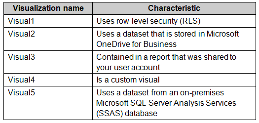
You plan to embed multiple visualization in a public website. Your Power BI infrastructure contains the visualizations configured as shown in the following table. Microsoft PL-300 question Which two visualizations can you embed into the website? Each correct answer presents a complete the solution. NOTE: Each correct selection is worth one point.
Options
6 comments in the community discussion
Probably B and D. Visual1 is a dashboard and Visual3 is in My Workspace, so those are the trap answers here. Reports in app workspaces are what's needed for "Publish to web," so B and D make sense. Pretty sure about this, but if anyone has seen different on the exam let me know.
B and D are right. Visual1 and Visual3 are dashboards or in "My Workspace" which can't be published to web, trick option there. Visual2 and Visual4 fit the requirements (app workspace, reports). Unless I'm missing a licensing twist, this lines up with official docs.
Q: 17

DRAG DROP You have a Power B1 semantic model that contains two tables named Dim Location and Fact Deliveries. The relationships between the tables are configured as shown in the following table. Microsoft PL-300 question The model contains one measure that has the following formula. Deliveries = COUNTROWS('fact Deliveries') Microsoft PL-300 question

Drag & Drop
7 comments in the community discussion
5
Deliveries by Destination = CALCULATE ([Deliveries], USERELATIONSHIP. This combo lets you activate that inactive destination relationship on the fly. I think that's the intended approach here, since only CALCULATE plus USERELATIONSHIP will do it in one go. If anyone thinks ALLSELECTED fits instead, let me know.
4
CALCULATE maps to the measure and USERELATIONSHIP as the filter argument. This is classic Power BI behavior, similar pattern shows up in lots of exam dumps. Still bugs me that Microsoft keeps reusing these relationship questions, wish they'd mix up the scenarios more.
Q: 18
What should you create to meet the reporting requirements of the sales department?
Options
6 comments in the community discussion
2
C vs B, I picked B since calculated columns let you store the count at the row level, which might help with certain visuals. Could be a trap though if they're after a dynamic measure.
B or C. I went with B because calculated columns can display a count per record, which might be what the sales team actually needs if they're exporting raw data. But if they want totals changing by filter, then C is right. Anyone else see similar nuances before?
Q: 19

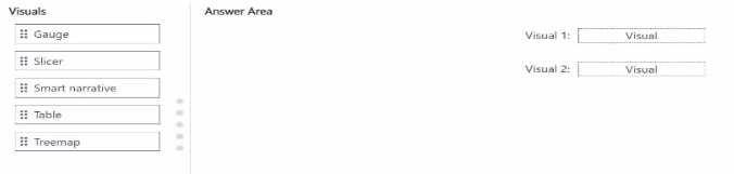
DRAG DROP You have a Power B1 semantic model that contains a table You need to create a Power B1 report page that contains two visuals that meet the following requirements: • Visual 1: Display* the distribution of hierarchical data • Visual 2: Search arid then filler by values Which type should you choose for each visual? To answer, drag the appropriate visual types to the correct visuals. Each visual type may be used once, more than once, or not at all. You may need to drag the split bar between panes or scroll to view content. NOTE: Each correct selection is worth one point. Microsoft PL-300 question
Drag & Drop
7 comments in the community discussion
3
Treemap for Visual 1, slicer for Visual 2. This is how it's set up in most real Power BI scenarios.
2
Treemap -> Visual 1, Slicer -> Visual 2. Table can filter but slicer is built for interactive search so I don't think it's a trick. Treemap is best for hierarchy display, not gauge or table.
Q: 20
You have a data model that contains many complex DAX expressions. The expressions contain frequent references to the RELATED and RELATEDTABLE functions. You need to recommend a solution to minimize the use of the RELATED and RELATEDTABLE functions. What should you recommend?
Options
6 comments in the community discussion
Why is D even an option for this? Transpose just flips the data, doesn't help with relationships at all.
Probably A. Merging tables in Power Query reduces the need to use RELATED/RELATEDTABLE because the columns are already together, so DAX gets a lot simpler. D is a bit of a trap here since transposing doesn't help with relationships. Pretty sure it's A but open to other takes.
Question 1 of 20

What's covered in this practice questions set

3: Visualize and analyze the data · 11 questions

📖 About this Domain

This domain covers the creation and configuration of Power BI reports and dashboards. You will transform semantic models into interactive data visualizations. The focus is on report authoring, enhancing usability, and performing data analysis directly within the report canvas.

🎓 What You Will Learn

  • Create reports by adding visuals, choosing appropriate visual types, and configuring page layouts and formatting.
  • Enhance reports for usability and storytelling by configuring bookmarks, creating custom tooltips, and applying conditional formatting.
  • Identify patterns and trends by using analytics features like reference lines, forecasting, and outlier detection.
  • Implement report interactivity by configuring slicers, filters, and editing visual interactions to build dynamic reports.

🛠️ Skills You Will Build

  • Report Authoring: You will build proficiency in designing and creating multi-page Power BI reports from a given semantic model.
  • Data Storytelling: You will develop the ability to use features like bookmarks and navigation to guide users through data insights.
  • Analytical Interpretation: You will gain skills in using the Analytics pane and DAX to perform time series analysis and identify key data points.
  • Report Optimization: You will learn to configure report elements for optimal user experience and performance, including slicer and filter management.

💡 Top Tips to Prepare

  • Gain hands-on experience in Power BI Desktop by creating reports with diverse visuals like matrix, scatter, and map visuals.
  • Master the configuration of visual interactions, understanding how cross-filtering and cross-highlighting work on the report canvas.
  • Practice extensively with the Analytics pane to apply features like trend lines, constant lines, and forecasting.
  • Understand how to configure report navigation using buttons, bookmarks, and page navigators for a seamless user experience.

4: Deploy and maintain assets · 6 questions

📖 About this Domain

This domain covers the management and distribution of Power BI assets within the Power BI service. It focuses on creating workspaces, deploying reports, and maintaining datasets. You will handle the final stage of the business intelligence lifecycle, ensuring content is accessible and secure.

🎓 What You Will Learn

  • You will learn to create and manage workspaces, assign workspace roles, and configure deployment pipelines for dev, test, and prod environments.
  • You will learn to publish reports and dashboards, configure a workspace app, and manage its audience.
  • You will learn to manage datasets by configuring scheduled refresh, setting up a data gateway, and providing access using the Build permission.
  • You will learn to implement governance by promoting or certifying Power BI content and managing row-level security (RLS) group membership.

🛠️ Skills You Will Build

  • You will build skills in Power BI service administration, including workspace configuration and user access management.
  • You will build the ability to manage the asset lifecycle using deployment pipelines for controlled content promotion.
  • You will build proficiency in data governance by implementing dataset security through RLS and managing content endorsement policies.
  • You will build skills to configure and troubleshoot dataset refresh operations, including managing data source credentials and gateway connections.

💡 Top Tips to Prepare

  • Master the differences between workspace roles like Admin, Member, Contributor, and Viewer to answer permission-based questions.
  • Practice creating a deployment pipeline and deploying content between stages to understand the CI/CD process in Power BI.
  • Get hands-on experience configuring a scheduled refresh for a dataset, both with and without a data gateway.
  • Focus on the process of creating RLS roles in Power BI Desktop and then assigning users to those roles in the Power BI service.

2: Model the data · 3 questions

📖 About this Domain

This domain covers key concepts related to 2: Model the data.

🎓 What You Will Learn

  • Core concepts of 2: Model the data
  • Best practices and implementation
  • Real-world application scenarios

🛠️ Skills You Will Build

  • Technical proficiency in 2: Model the data
  • Problem-solving abilities
  • Practical implementation skills

💡 Top Tips to Prepare

  • Review official documentation and study guides
  • Practice with hands-on exercises
  • Focus on understanding core principles

Premium Access Includes

  • Quiz Simulator
  • Exam Mode
  • Progress Tracking
  • Question Saving
  • Flash Cards
  • Drag & Drops
  • 3 Months Access
  • PDF Downloads
Get Premium Access
Scroll to Top

FLASH OFFER

Days
Hours
Minutes
Seconds

avail 10% DISCOUNT on YOUR PURCHASE