Q: 1
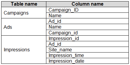
You have the tables shown in the following table.
 The Impressions table contains approximately 30 million records per month.
You need to create an ad analytics system to meet the following requirements:
Present ad impression counts for the day, campaign, and Site_name. The analytics for the last year
are required.
Minimize the data model size.
Which two actions should you perform? Each correct answer presents part of the solution.
NOTE: Each correct selection is worth one point.
The Impressions table contains approximately 30 million records per month.
You need to create an ad analytics system to meet the following requirements:
Present ad impression counts for the day, campaign, and Site_name. The analytics for the last year
are required.
Minimize the data model size.
Which two actions should you perform? Each correct answer presents part of the solution.
NOTE: Each correct selection is worth one point.
 The Impressions table contains approximately 30 million records per month.
You need to create an ad analytics system to meet the following requirements:
Present ad impression counts for the day, campaign, and Site_name. The analytics for the last year
are required.
Minimize the data model size.
Which two actions should you perform? Each correct answer presents part of the solution.
NOTE: Each correct selection is worth one point.
The Impressions table contains approximately 30 million records per month.
You need to create an ad analytics system to meet the following requirements:
Present ad impression counts for the day, campaign, and Site_name. The analytics for the last year
are required.
Minimize the data model size.
Which two actions should you perform? Each correct answer presents part of the solution.
NOTE: Each correct selection is worth one point.Options
Discussion
Option B and C for sure. Creating one-to-many relationships (B) keeps the data clean and you can count impressions with a lightweight measure (C), which won’t bulk up the model. No need for a calculated table here I think, unless I missed something. Agree?
B tbh, calculated tables like D would just make the data model bigger and aren't needed. Setting up one-to-many relationships (B) lets you slice and dice by ad, site, and date, and a measure using COUNTROWS (C) gives you counts without loading tons more data. Saw a similar question in practice sets. Anyone see a legit case where A makes sense here? Pretty sure B and C.
Guessing D here. If you create a calculated table with Ad_id, Site_name, and Impression_date, you can pre-aggregate the data which should make querying faster and keep things tidy. Not sure if it’s the smallest model though, but looks like an option.
Its B and C, model stays small with just a measure for counting rows and the relationships handle all the slicing by day or site/campaign. No need for another calculated table if you want to avoid a memory hit!
B tbh, relationships let you slice/filter across tables without copying tons of data. C is efficient for counting since measures barely add to model size. D looks tempting for pre-aggregating but actually bloats memory. I think B and C are made for the minimize size angle, not D. Disagree?
A classic Microsoft question where aggregate tables always feel safer.
I would go with A here.
Makes sense to me, B and C. Building the one-to-many relationships (B) keeps everything normalized, and a calculated measure (C) is way lighter than creating extra tables. Since they want minimal model size and last year's analytics, this combo fits. Anyone pick D here for any reason?
C vs D? Calculated measure (C) barely adds size, but a calculated table like D could bloat the model. If you just need counts and want to keep it lean, C makes more sense here I think. Let me know if that doesn't add up.
Option D
Be respectful. No spam.
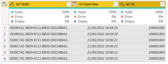 The IOT ID columns are unique to each row in query.
You need to analyze 10T events by the hour and day of the year. The solution must improve dataset
performance.
Solution: You change the IOT DateTime column to the Date data type.
Does this meet the goal?
The IOT ID columns are unique to each row in query.
You need to analyze 10T events by the hour and day of the year. The solution must improve dataset
performance.
Solution: You change the IOT DateTime column to the Date data type.
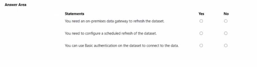
Does this meet the goal?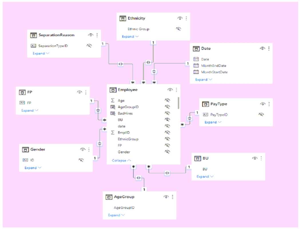 Use the drop-down menus to select the answer choice that completes each statement based on the information presented in the graphic. NOTE: Each correct selection is worth one point.
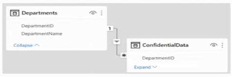 There are four departments in the Departments table.
You need to ensure that users can see the data of their respective department only.
What should you do?
There are four departments in the Departments table.
You need to ensure that users can see the data of their respective department only.
What should you do?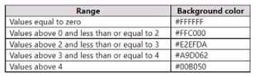 Which three actions should you perform in sequence in Power B) Desktop? To answer, move the appropriate actions from the list of actions to the answer area and arrange them in the correct order.
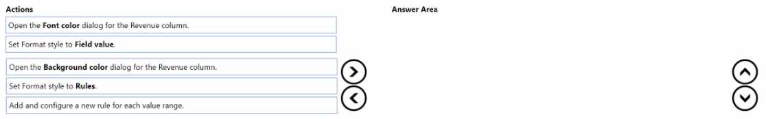
 Use the drop-down menus to select the answer choice that completes each statement based on the information presented in the graphic. NOTE: Each correct selection is worth one point.
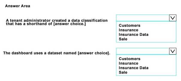
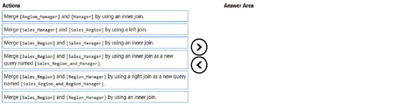
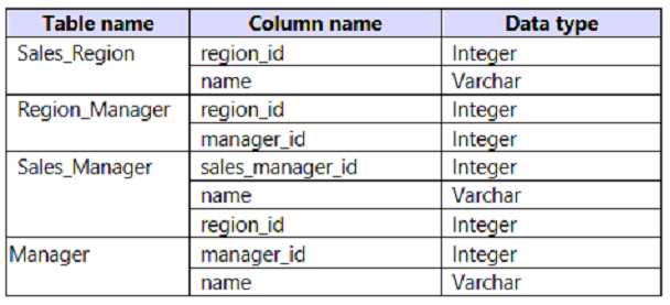 The model has the following relationships: *There is a one-to-one relationship between Sales_Region and Region_Manager. *There are more records in Manager than in Region_Manager, but every record in Region_Manager has a corresponding record in Manager. *There are more records in Sales_Manager than in Sales_Region, but every record in Sales_Region has a corresponding record in Sales_Manager. You need to denormalize the model into a single table. Only managers who are associated to a sales region must be included in the reports. Which three actions should you perform in sequence? To answer, move the appropriate actions from the list of actions to the answer area and arrange them in the correct order. NOTE: More than one order of answer choices is correct. You will receive credit for any of the correct orders you select.