Free Practice Test

Free PL-300 Practice Exam – 2025 Updated

Get Ready Smarter for the PL-300 Exam with Our Free and Reliable PL-300 Exam Questions โ€“ Updated for 2025.

At Cert Empire, we focus on providing the most accurate and up-to-date exam questions for students preparing for the Microsoft PL-300 Exam. To make preparation easier, weโ€™ve opened parts of our PL-300 study resources free for everyone. You can practice as much as you need with Free PL-300 Practice Test.

Question 1

You have a Power Bl workspace that contains a dataset. a report, and a dashboard. The following groups have access: โ€ข External users can access the dashboard. โ€ข Managers can access the dashboard and a manager-specific report. โ€ข Employees can access the dashboard and a row-level security (RLS) constrained report. You need all users, including the external users, to be able to tag workspace administrators if they identify an issue with the dashboard. The solution must ensure that other users see the issues that were raised. What should you use?
Options
A: subscriptions
B: comments
C: alerts
D: chat in Microsoft Teams
Show Answer
Correct Answer:
comments
Explanation
The comments feature in the Power BI service is designed for collaboration directly on dashboards and reports. It allows all users with access, including external guest users, to add comments. Crucially, it supports "@" mentions, which can be used to tag and notify workspace administrators about an issue. The comment thread is visible to everyone who can view the dashboard, ensuring that other users can see the issues that were raised. This directly meets all the requirements of the scenario.
Why Incorrect Options are Wrong

A. subscriptions: Subscriptions are used to schedule and email snapshots of reports and dashboards to users. They do not provide a mechanism for feedback or collaborative issue tracking.

C. alerts: Data alerts are automated notifications triggered when data in a dashboard tile crosses a predefined threshold. They are not a tool for users to manually report issues.

D. chat in Microsoft Teams: While Power BI content can be shared in Teams for discussion, this creates a separate communication channel. The comments feature is a more integrated, native solution within the Power BI service itself.

References

1. Microsoft Learn. (2023). Add comments to dashboards and reports in the Power BI service.

Section: "Add a general comment" and "Comment on a specific visual"

Content: This document explicitly states, "You can add comments to an entire dashboard... You can also @mention others to pull them into the conversation." It confirms that comments are a collaborative feature visible to those with access.

2. Microsoft Learn. (2023). Email subscriptions for Power BI reports and dashboards.

Section: "Subscribe to a report or dashboard"

Content: This source details the functionality of subscriptions, which is to "receive an email with a snapshot of the report or dashboard." This confirms it is a content delivery system, not a communication tool.

3. Microsoft Learn. (2023). Data alerts in the Power BI service.

Section: "Set data alerts in the Power BI service"

Content: This document explains that alerts are used to "get notified when data in your dashboards changes above or below limits you set." This confirms alerts are for automated data monitoring, not user-initiated communication.

Question 2

You have a report in Power Bl named report1 that is based on a shared dataset. You need to minimize the risk of data exfiltration for report1. The solution must prevent other reports from being affected. What should you do?
Options
A: Clear Allow recipients to share your dashboard and Allow users to build new content using the underlying datasets for the dataset.
B: Select the Allow end users to export both summarized and underlying data from the service or Report Server Export data option for the report.
C: Select the Don't allow end users to export any data from the service or Report Server Export data option for the report.
D: Apply row-level security (RLS) to the shared dataset.
Show Answer
Correct Answer:
Select the Don't allow end users to export any data from the service or Report Server Export data option for the report.
Explanation
To minimize data exfiltration for a single report without affecting other reports using the same shared dataset, you must apply a report-level setting. The "Export data" option in the report's settings allows you to control data export specifically for that report. Selecting "Don't allow end users to export any data" directly prevents users from exporting summarized or underlying data from visuals in report1, thereby mitigating the risk of data exfiltration. This change is isolated to report1 and does not alter the shared dataset or any other reports connected to it.
Why Incorrect Options are Wrong

A. Modifying dataset permissions affects all reports and users connected to that shared dataset, violating the requirement that other reports should not be affected.

B. This option explicitly allows data export, which increases the risk of data exfiltration, directly contradicting the goal of the question.

D. Row-level security (RLS) is applied at the dataset level, which would affect all reports using that dataset. It restricts data access but does not prevent the export of visible data.

References

1. Microsoft Learn. (2023). Change report settings in the Power BI service.

Section: "Export data"

Content: This document details the report-level settings for data export. It explicitly lists the option to set export permissions to "None," which "prevents your report readers from exporting any data from your report." This confirms it is a report-specific control.

2. Microsoft Learn. (2024). Build permission for shared datasets.

Section: "Ways to get Build permission"

Content: This document clarifies that "Build permission is a dataset-level permission." Modifying it, as suggested in option A, would impact anyone trying to build content from the shared dataset, thus affecting more than just report1.

3. Microsoft Learn. (2024). Row-level security (RLS) with Power BI.

Section: "Set up RLS"

Content: The documentation explains that RLS is configured on the model (dataset) in Power BI Desktop and then managed in the Power BI service. This confirms RLS is a dataset-level feature and would apply to all reports using that dataset.

Question 3

HOTSPOT You have a Power Bl report. You have the following tables. PL-300 exam question You have the following DAX measure. PL-300 exam question PL-300 exam question

Show Answer
Correct Answer:

HTTPS://KXBJSYUHCEGGSYVXDKOF.SUPABASE.CO/STORAGE/V1/OBJECT/PUBLIC/FILE-IMAGES/PL-300/PAGE_311_IMG_2.JPG


Explanation

The DAX measure [Accounts] is designed to count the number of unique accounts. A standard implementation for this would be DISTINCTCOUNT(Balances[AccountID]). This measure operates within the filter context provided by the visual.

  • Day Level: When the table visual is at the day level, the filter context for the measure is a single day. The measure will count the distinct accounts that have a record in the Balances table for that specific day, which correctly represents the number of accounts live on that day.
  • Month and Year Level: When the context is expanded to a month or a year, the DISTINCTCOUNT function will count every unique account that had a balance record on at least one day within that period. It does not ensure the account was active for every single day of the period. An account active for only one day in a year will be counted the same as an account active for all 365 days. Therefore, the measure does not show accounts that were live throughout the entire month or year.
References

Microsoft Corporation. (n.d.). DISTINCTCOUNT function (DAX). Microsoft Learn. Retrieved from https://learn.microsoft.com/en-us/dax/distinctcount-function-dax

This document states that the function "counts the number of distinct values in a column." When applied over a date range, it counts all distinct values that appear at any point within that range.

Microsoft Corporation. (n.d.). Understanding filter context. Power BI Documentation. Retrieved from https://learn.microsoft.com/en-us/power-bi/transform-model/desktop-evaluation-context#filter-context

This resource explains how visuals, such as a table grouped by a date hierarchy, create a filter context that constrains DAX calculations to a subset of data (e.g., a specific day, month, or year).

Russo, M., & Ferrari, A. (2019). The Definitive Guide to DAX: Business intelligence for Microsoft Power BI, SQL Server Analysis Services, and Excel (2nd ed.). Microsoft Press.

Chapter 4, "Evaluation Contexts," explains in detail how filter context is applied at different granularities and how measures like DISTINCTCOUNT operate within that context. It confirms that a distinct count over a period includes items present at any point in the period, not necessarily throughout.

Question 4

HOTSPOT You have a Power Bl report named Orders that supports the following analysis: โ€ข Total sales over time โ€ข The count of orders over time โ€ข New and repeat customer counts The data model size is nearing the limit for a dataset in shared capacity. The model view for the dataset is shown in the following exhibit. PL-300 exam question PL-300 exam question

Show Answer
Correct Answer:

YES

NO

NO

Explanation

Summarizing Orders (Yes): This is a standard data reduction technique. By summarizing or aggregating the Orders table (which is likely at a transaction line level), you reduce the total number of rows. A new table grouped by CustomerID, OrderID, and OrderDate would contain one row per order instead of one row per product line within an order. This significantly reduces the model size. To support the "Total sales over time" analysis, a new column for the total sales amount would be created during this summarization process. The other analysesโ€”counting orders and analyzing customersโ€”remain possible because OrderID, CustomerID, and OrderDate are retained.


Removing CustomerID (No): Removing the CustomerID column from the Orders fact table would break the relationship with the Customers dimension table. While this would reduce the model size, it would make it impossible to perform the "New and repeat customer counts" analysis, as there would be no way to link an order to a specific customer.


Removing UnitPrice and Discount (No): These columns are necessary to calculate the Total Sales measure (e.g., Sales = Quantity * UnitPrice * (1 - Discount)). Removing them would make it impossible to support the "Total sales over time" analysis, even though it would reduce the model size.

References

Microsoft Power BI Documentation: In the guidance on data reduction techniques for Import modeling, summarizing data is a key strategy. The documentation states, "Use Power Query to group by columns, and aggregate your data... It can result in a significant data reduction." This directly supports the first statement, as summarizing is a valid and effective method to reduce model size while maintaining analytical capability by pre-aggregating measures. (See: Microsoft Docs, Power BI guidance, Data reduction techniques for Import modeling).

Kimball, R., & Ross, M. (2013). The Data Warehouse Toolkit: The Definitive Guide to Dimensional Modeling (3rd ed.). Wiley. Chapter 2 discusses the grain of a fact table. The process described in the first statement is equivalent to raising the grain of the fact table from an individual transaction line to the order header. This is a fundamental technique in dimensional modeling to manage performance and data volume for large datasets. Removing foreign keys (Statement 2) or measure source columns (Statement 3) violates basic dimensional modeling principles for supporting the required analyses.

Question 5

You have the Power Bl model shown in the following exhibit. PL-300 exam question There are four departments in the Departments table. You need to ensure that users can see the data of their respective department only. What should you do?
Options
A: Create a row-level security (RLS) role for each department, and then define the membership of the role.
B: Create a DepartmentID parameter to filter the Departments table.
C: To the ConfidentialData table, add a calculated measure that uses the currentgroup DAX function.
D: Create a slicer that filters Departments based on DepartmentID.
Show Answer
Correct Answer:
Create a row-level security (RLS) role for each department, and then define the membership of the role.
Explanation
The requirement is to restrict data access so that users can only view data corresponding to their specific department. This is the primary use case for Row-Level Security (RLS) in Power BI. RLS is implemented by creating roles within the Power BI model. For each role, a DAX filter expression is defined on a table (in this case, the Departments table). When a user assigned to a specific role accesses the report in the Power BI service, this DAX filter is automatically applied, restricting the rows of data they can see throughout the entire model. This method enforces security at the data model level.
Why Incorrect Options are Wrong

B. A parameter is a user-controlled input for interactive analysis, not a security feature. A user could easily change the parameter value to view data from other departments.

C. The CURRENTGROUP DAX function is used within grouping functions like SUMMARIZECOLUMNS to perform calculations on grouped data; it is not related to user-based security.

D. A slicer is a visual filter on the report canvas that users can freely interact with. It does not enforce security, as a user could modify or remove the slicer.

References

1. Microsoft Learn. (2024). Restrict data access with row-level security (RLS) for Power BI. Microsoft Power BI Documentation. Retrieved from https://learn.microsoft.com/en-us/power-bi/enterprise/service-admin-rls.

Reference Details: The section "Define roles and rules in Power BI Desktop" explicitly states, "You can define roles and rules within Power BI Desktop. When you publish to Power BI, it also publishes the role definitions... To define security roles, follow these steps. 1. Import data into your Power BI Desktop report, or configure a DirectQuery connection. ... 2. From the Modeling tab, select Manage Roles." This directly supports the process described in option A.

2. Microsoft Learn. (2024). Implement row-level security. PL-300: Design and build a data model in Power BI learning path. Retrieved from https://learn.microsoft.com/en-us/training/modules/design-build-tabular-model-power-bi/7-implement-row-level-security.

Reference Details: This official PL-300 courseware notes, "Row-level security (RLS) is a Power BI feature that can be used to restrict data access for given users. Filters restrict data access at the row level, and you can define filters within roles... You will implement RLS by creating one or more roles. A role has a unique name in the model, and it will typically include one or more rules."

3. Microsoft Learn. (2024). Row-level security (RLS) guidance in Power BI Desktop. Power BI Guidance Documentation. Retrieved from https://learn.microsoft.com/en-us/power-bi/guidance/rls-guidance.

Reference Details: The section "Implement RLS" details the process: "In Power BI Desktop, you can create a role by navigating to the Modeling ribbon and selecting Manage roles. In the Manage roles window, you can create, modify, or delete roles... You add a rule to a table by using a DAX expression that must return a TRUE or FALSE value." This confirms that creating roles and defining rules is the correct procedure.

Question 6

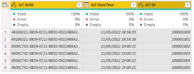
HOTSPOT You have a column named UnitslnStock as shown in the following exhibit. PL-300 exam question UnitsInStock has 75 non-null values, of which 51 are unique. Use the drop-down menus to select the answer choice that completes each statement based on the information presented in the graphic. NOTE: Each correct selection is worth one point. PL-300 exam question
Show Answer
Correct Answer:

WHEN A TABLE VISUAL IS CREATED IN A REPORT AND UNITSINSTOCK IS ADDED TO THE VALUES, THERE WILL BE 75 ROWS IN THE TABLE.

CHANGING THE SUMMARIZE BY SETTING OF THE UNITSINSTOCK COLUMN, AND THEN ADDING THE COLUMN TO A TABLE VISUAL, WILL REDUCE THE NUMBER OF ROWS IN THE TABLE VISUAL.

Explanation

The UnitsInStock column has its Summarize by property set to None. When a numeric column with this setting is added to a table visual, Power BI does not aggregate the data. Instead, it displays each individual value on a separate row. Since the column has 75 non-null values, the table will display 75 rows.


Changing the Summarize by setting from 'None' to an aggregation function (such as Sum, Average, or Count) alters this behavior. When the column is subsequently added to a table, Power BI will perform the specified calculation and display a single, aggregated result (assuming no other grouping columns are present). This changes the output from 75 individual rows to a single summary row, thus reducing the number of rows.

References

Microsoft Power BI Documentation: In the "Use aggregation in Power BI Desktop" article, it states: "If you set the summarization to Do not summarize, then whenever you add that column to a visual, Power BI will simply show each of its values." This confirms that without summarization, all individual values are listed.

Source: Microsoft Learn, Power BI Documentation, "Use aggregation (sum, average, etc.) in Power BI Desktop," Section: "Change the aggregation type."

Microsoft Power BI Documentation: The default behavior for numeric fields is aggregation. As explained in the documentation, "When you add a numeric field...to a visual in a Power BI report, it's aggregated by default. It might be a sum, average, count...". Enabling summarization (by changing it from 'None') causes the data to be aggregated into fewer rows, typically one if it's the only field in the values well.

Source: Microsoft Learn, Power BI Documentation, "Intro to aggregations in Power BI," Section: "Why use aggregations?"

Question 7

DRAG DROP You plan to create a report that will display sales data from the last year for multiple regions You need to restrict access to individual rows of the data on a per region-basis by using roles. Which four actions should you perform in sequence? To answer, move the appropriate actions from the list of actions to the answer area and arrange them in the correct order. PL-300 exam question

Show Answer
Correct Answer:

IMPORT THE DATA TO POWER BI DESKTOP.

CREATE A ROLE DEFINITION.

PUBLISH THE REPORT.

ASSIGN USERS TO THE ROLE.

Explanation

The process of implementing Row-Level Security (RLS) in Power BI follows a specific workflow. First, you must bring your data into Power BI Desktop. Once the data model is available, you define the security rules by creating roles and applying DAX filter expressions to the tables. After defining the roles within the .pbix file, the report must be published to the Power BI service. The final step, which can only be done in the service, is to navigate to the dataset's security settings and assign specific users or groups to the roles you created, thereby activating the security restrictions for them.

References

Microsoft. (2024). Row-level security (RLS) with Power BI. Microsoft Learn. Retrieved from https://learn.microsoft.com/en-us/power-bi/enterprise/service-admin-rls.

Details: The "Set up roles in Power BI Desktop" section outlines the initial steps: "1. Import data into your Power BI Desktop report... 2. From the Modeling tab, select Manage Roles." This supports the first two steps in the sequence. The "Manage security on your model" section details the subsequent actions: "...you need to publish your report to the Power BI service... In the Power BI service, you can assign members to the role." This confirms the final two steps.

Question 8

You import a Power Bl dataset that contains the following tables: โ€ข Date โ€ข Product โ€ข Product Inventory The Product inventory table contains 25 million rows. A sample of the data is shown in the following table. PL-300 exam question The Product Inventory table relates to the Date table by using the DateKey column. The Product inventory table relates to the Product table by using the ProductKey column. You need to reduce the size of the data model without losing information. What should you do?
Options
A: Change Summarization for DateKey to Don't Summarize.
B: Change the data type of UnitCost to Integer.
C: Remove the relationship between Date and Product Inventory.
D: Remove MovementDate.
Show Answer
Correct Answer:
Remove MovementDate.
Explanation
The Product Inventory table contains both a DateKey column (used for the relationship to the Date table) and a MovementDate column. Since the DateKey already links each record to a specific date in the Date dimension table, the MovementDate column is redundant. All date-related information (year, month, day, etc.) can be retrieved via the relationship. Removing the unnecessary MovementDate column from the 25-million-row fact table is a primary optimization technique. This action significantly reduces the model's memory footprint by eliminating a high-cardinality column without any loss of analytical information.
Why Incorrect Options are Wrong

A. Changing summarization is a metadata setting that affects default report behavior; it does not reduce the data model's storage size.

B. Changing the UnitCost data type to Integer would truncate decimal values (e.g., 12.02 becomes 12), resulting in a loss of information.

C. Removing the relationship between the tables would break the ability to analyze inventory by date, which is a critical loss of analytical capability.

References

1. Microsoft Learn. (2023). Data reduction techniques for Import modeling. In Power BI guidance.

Reference: Under the section "Remove unnecessary columns," the documentation states, "Columns that don't serve a purpose should be removed from your model... It's a best practice to remove any columns that aren't used for relationships, measures, or displaying in visuals." In this scenario, MovementDate is redundant because DateKey serves the relationship purpose.

2. Microsoft Learn. (2023). Understand star schema and the importance for Power BI. In Power BI guidance.

Reference: This document describes that fact tables should contain foreign keys (like DateKey) and numeric measures. Descriptive attributes (like a full date) should reside in the related dimension tables. The presence of MovementDate in the fact table violates this principle when a proper Date dimension exists, confirming its redundancy.

Question 9

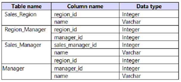
HOTSPOT You plan to create a Power Bl dataset to analyze attendance at a school. Data will come from two separate views named View1 and View? in an Azure SQL database. View1 contains the columns shown in the following table. PL-300 exam question View2 contains the columns shown in the following table. PL-300 exam question The views can be related based on the Class ID column. Class ID is the unique identifier for the specified class, period, teacher, and school year. For example, the same class can be taught by the same teacher during two different periods, but the class will have a different class ID. You need to design a star schema data model by using the data in both views. The solution must facilitate the following analysis: The count of classes that occur by period The count of students in attendance by period by day The average number of students attending a class each month In which table should you include the Teacher First Name and Period Number fields? To answer, select the appropriate options in the answer area. NOTE: Each correct selection is worth one point. PL-300 exam question

Show Answer
Correct Answer:

TEACHER FIRST NAME: TEACHER DIMENSION

PERIOD NUMBER: ATTENDANCE FACT


Explanation

In dimensional modeling, the goal is to create a star schema consisting of a central fact table and multiple surrounding dimension tables.

  1. Fact Tables: Contain quantitative measures and foreign keys to dimension tables. The Attendance data from View2 is transactional and forms the basis of the Attendance fact table.
  2. Dimension Tables: Contain descriptive, categorical attributes that describe the factual data. Attributes like teacher names, class subjects, and period times are used to slice and dice the measures in the fact table.

Teacher First Name is a descriptive attribute of a teacher entity. The best practice is to create a separate Teacher dimension containing fields like Teacher ID, Teacher First Name, and Teacher Last Name. This avoids data redundancy and organizes the model logically.

Period Number is required to analyze attendance counts by period. For the Attendance fact table to be filterable by period, it must contain a key related to the period. Since the source data for the facts (View2) already includes Period Number, it should be included in the Attendance fact table as a foreign key that links to a Period dimension.

References

Kimball, R., & Ross, M. (2013). The Data Warehouse Toolkit: The Definitive Guide to Dimensional Modeling (3rd ed.). Wiley.

Chapter 2, "Retail Sales": This chapter introduces the core concepts of fact and dimension tables. It explains that descriptive textual attributes (like a teacher's name) belong in dimension tables, while numeric keys that connect facts to dimensions belong in the fact table (p. 25-29).

Microsoft Power BI Documentation. (2023). "Understand star schema and the importance for Power BI."

Section: "Fact tables": The documentation states, "The fact table contains dimension key columns that relate to dimension tables...". This confirms that keys needed for slicing data, like Period Number, must be present in the fact table to link to their respective dimension tables.

Section: "Dimension tables": This section clarifies that dimension tables "store the attributes that describe your business entities," which directly applies to placing Teacher First Name in a Teacher dimension.

Question 10

You have more than 100 published datasets. Ten of the datasets were verified to meet your corporate quality standards. You need to ensure that the 10 verified datasets appear at the top of the list of published datasets whenever users search for existing datasets. What should you do?
Options
A: Publish the datasets in an app.
B: Promote the datasets.
C: Feature the dataset on the home page.
D: Certify the datasets.
Show Answer
Correct Answer:
Certify the datasets.
Explanation
Certification is the designated process in Power BI for marking datasets as authoritative and trustworthy, confirming they meet an organization's quality standards. Certified datasets are given the highest priority and a special badge in discovery experiences, such as the Data hub and when connecting to data from Power BI Desktop. This ensures they appear at the top of any list when users search for datasets, directly fulfilling the requirement. Promotion is a lower level of endorsement and ranks below certified content.
Why Incorrect Options are Wrong

A. Publish the datasets in an app: This bundles content for consumption but does not affect the ranking of datasets in discovery lists.

B. Promote the datasets: While promotion increases visibility, certification provides a higher level of endorsement and a higher rank in search results, aligning with "corporate quality standards."

C. Feature the dataset on the home page: This provides a shortcut on the Power BI Home page but does not influence the order of datasets in search results.

References

1. Microsoft Learn. (2023, October 24). Endorsement: Promote and certify Power BI content. In the "How endorsement works" section, it states, "Certified content is ranked first in lists and search results, and is marked with a certification badge." It also notes, "Certification is a bigger deal than promotion. You can certify content only if your Power BI admin has configured and enabled certification for your organization." This directly supports that certification is the correct action for datasets verified against corporate standards to achieve top ranking.

2. Microsoft Learn. (2023, October 24). Enable content certification. In the "Set up content certification" section, it explains, "Certification is a way to highlight quality content. To ensure that only authoritative content gets certified, Power BI admins decide who can certify content." This aligns with the scenario's need to elevate datasets that meet "corporate quality standards."

3. Microsoft Learn. (2023, October 24). Data discovery using the data hub. The article illustrates how endorsed datasets are displayed prominently in the Data hub, stating, "The list of datasets shows you the workspace they reside in, as well as whether they're certified or promoted." This confirms that certification directly impacts visibility in user search experiences.

Question 11

You have a Power Bl workspace named Workspace1 that contains a dataset named DS1 and a report named RPT1. A user wants to create a report by using the data In DS1 and publish the report to another workspace. You need to provide the user with the appropriate access. The solution must minimize the number of access permissions granted to the user. What should you do?
Options
A: Share RPT1 with the user.
B: Add the user as a Viewer of Workspace1.
C: Add the user as a member of Workspace1.
D: Grant the Build permission for DS1 to the user.
Show Answer
Correct Answer:
Grant the Build permission for DS1 to the user.
Explanation
The Build permission is specifically designed to allow users to connect to an existing dataset and create new content, such as reports, without granting them access to edit content in the original workspace. This is the most granular permission that meets the user's requirement. By granting only the Build permission for the dataset DS1, the user can create a new report in Power BI Desktop and then publish it to another workspace where they have the necessary Contributor, Member, or Admin role. This approach adheres to the principle of least privilege by not granting unnecessary permissions like viewing or editing other items in Workspace1.
Why Incorrect Options are Wrong

A. Share RPT1 with the user.

Sharing a report only grants read access to that specific report; it does not provide permission to connect to the underlying dataset to create new reports.

B. Add the user as a Viewer of Workspace1.

The Viewer role provides read-only access to all content in the workspace but does not include the Build permission required to create new reports from the datasets.

C. Add the user as a member of Workspace1.

The Member role grants excessive permissions, including the ability to publish and edit content within Workspace1, which violates the requirement to minimize permissions.

References

1. Microsoft Learn. (2023). Build permission for shared datasets.

Reference: In the "Ways to get Build permission" section, it states, "Build permission lets you build new content on a dataset... Examples of new content are reports, dashboards, pinned tiles from Q&A, paginated reports, and Insights Discovery." This directly supports granting Build permission for the user's task.

2. Microsoft Learn. (2024). Roles in workspaces in Power BI.

Reference: The table detailing workspace roles shows that the Viewer role has "Read" and "Read data" permissions but lacks "Build" permission. It also shows that Member and Contributor roles have Build permission but also include other permissions like "Publish" and "Share" within that workspace, making them less minimal than granting Build permission directly on the dataset.

3. Microsoft Learn. (2023). Share Power BI reports and dashboards with coworkers and others.

Reference: Under the "Share a report via link" section, the permissions granted are detailed. It clarifies that sharing a report gives recipients viewing access, and optionally reshare or build permissions, but the act of sharing itself (Option A) is primarily for viewing, not building, unless explicitly configured. Granting Build directly (Option D) is the most direct method.

Question 12

You have a Power Bl report that uses row-level security (RLS). You need to transfer RLS membership maintenance to an Azure network security team. The solution must NOT provide the Azure network security team with the ability to manage reports, datasets. or dashboards. What should you do?
Options
A: Add the Azure network security team as members of the RLS role.
B: Instruct the Azure network security team to create security groups. Configure RLS to use the groups.
C: Configure custom instructions for the Request access feature that instructs users to contact the Azure network security team.
D: Grant the Read and Build permissions for the Power Bl datasets to the Azure network security team.
Show Answer
Correct Answer:
Instruct the Azure network security team to create security groups. Configure RLS to use the groups.
Explanation
The most effective and secure method to delegate Row-Level Security (RLS) membership management is by using security groups from Microsoft Entra ID (formerly Azure Active Directory). A Power BI workspace administrator assigns a security group to a specific RLS role within the Power BI service. Subsequently, the Azure network security team can manage the user membership of that security group directly within the Microsoft Entra admin center. This approach perfectly aligns with the requirements, as the security team does not need any permissions within the Power BI workspace to add or remove users from the group, thereby preventing them from managing any Power BI content.
Why Incorrect Options are Wrong

A. Add the Azure network security team as members of the RLS role.

This action would grant the team data access according to the role's filter, not the ability to manage the role's membership.

C. Configure custom instructions for the Request access feature that instructs users to contact the Azure network security team.

This creates a manual, indirect workflow. The security team would still need someone with Power BI permissions to actually update the RLS membership.

D. Grant the Read and Build permissions for the Power Bl datasets to the Azure network security team.

Read and Build permissions allow for viewing reports and creating new content, respectively. Neither permission grants the ability to manage RLS role assignments.

References

1. Microsoft Learn, "Row-level security (RLS) with Power BI," Assign users to a role in the Power BI service section.

"In the Power BI service, you can add a member to a role by typing in the email address or name of the user or security group. You can't add Distribution groups created in Microsoft 365 to RLS roles. You can add security groups that are mail-enabled or created directly in Microsoft Entra ID." This document explicitly supports using security groups for RLS role assignment, which is the core mechanism of the correct answer.

2. Microsoft Learn, "Roles in workspaces in Power BI," Workspace roles table.

This documentation details the permissions for each workspace role. To manage dataset security, which includes RLS, a user requires at least a 'Member' role. The 'Read' and 'Build' permissions mentioned in option D are insufficient for managing RLS. Granting the security team a Member role would violate the requirement that they cannot manage reports or datasets.

3. Microsoft Entra Documentation, "Manage Microsoft Entra groups and group membership," Add or remove a member from a group section.

This source outlines the process for managing group membership within Microsoft Entra ID. It demonstrates that this is an administrative task separate from Power BI, confirming that the security team can perform their duties without needing access to the Power BI workspace.

Question 13

DRAG DROP You use Power Bi Desktop to create a Power Bl data model and a blank report. You need to add the Word Cloud visual shown in the following exhibit to the report. PL-300 exam question The solution must minimize development effort Which three actions should you perform in sequence? To answer, move the appropriate actions from the list of actions to the answer area and arrange them in the correct order. PL-300 exam question

Show Answer
Correct Answer:
  1. FROM POWER BI DESKTOP, GET THE WORD CLOUD VISUAL FROM MICROSOFT APPSOURCE.
  2. POPULATE THE CATEGORY, VALUE, AND EXCLUDES FIELDS.
  3. FORMAT THE DATA COLORS AND TITLE.


Explanation

Creating a Word Cloud visual in Power BI, which is not a native visual, involves a clear sequence of steps focused on efficiency.

  1. Get the Visual: The first step is to acquire the custom visual. The most direct and effort-minimizing method is to import it directly from Microsoft AppSource within the Power BI Desktop application itself, rather than downloading the .pbiviz file from a web browser and then importing it manually.
  2. Add Data: Once the visual is added to the report canvas, it is empty. The next logical step is to populate it with data by dragging the relevant data fields into the visual's specific wells, such as Category (for the words), Value (to determine word size), and Excludes (to filter out unwanted words).
  3. Format the Visual: After the visual is populated with data and functioning, the final step is to format its aesthetic properties, such as changing colors, adjusting the title, and modifying other display settings to meet the design requirements.

References

Microsoft Learn, Power BI Documentation. "Import a custom visual from AppSource in Power BI." This document outlines the procedure for adding custom visuals. The most efficient method described is importing directly from Power BI Desktop: "You can search and import custom visuals from within Power BI Desktop... It's the easiest way to discover and add custom visuals." This supports the selection of the first action.

Microsoft Learn, Power BI Documentation. "Tutorial: Simple Word Cloud." This tutorial details the usage of the Word Cloud custom visual. Under the section "Create a word cloud," it explicitly states the need to populate the Category field to generate the words and optionally the Values field to influence their size. This confirms the second action in the sequence.

Microsoft Learn, Power BI Documentation. "Get started formatting Power BI visualizations." This guide explains that formatting options in the Format visual pane are used to customize the appearance of a visual (e.g., titles, colors, labels) after it has been created and populated with data. This validates the placement of the formatting action as the final step.

Question 14

You have a Microsoft Power Bl report. The size of PBIX file is 550 MB. The report is accessed by using an App workspace in shared capacity of powerbi.com. The report uses an imported dataset that contains one fact table. The fact table contains 12 million rows. The dataset is scheduled to refresh twice a day at 08:00 and 17:00. The report is a single page that contains 15 custom visuals and 10 default visuals. Users say that the report is slow to load the visuals when they access and interact with the report You need to recommend a solution to improve the performance of the report. What should you recommend?
Options
A: Replace the default visuals with AppSource visuals.
B: Change any DAX measures to use iterator functions.
C: Remove unused columns from tables in the data model.
D: Increase the number of times that the dataset is refreshed
Show Answer
Correct Answer:
Remove unused columns from tables in the data model.
Explanation
The report's performance issue is indicated by the large PBIX file size (550 MB) and the high number of rows in the fact table. In Power BI's Import mode, the VertiPaq storage engine compresses data on a per-column basis. Removing unused columns is a fundamental and highly effective optimization technique. It directly reduces the data model's size in memory, leading to faster data processing, quicker visual rendering, and improved interactive performance. A smaller, more efficient data model is the primary solution for the described slowness.
Why Incorrect Options are Wrong

A. Replace the default visuals with AppSource visuals.

AppSource (custom) visuals are not inherently more performant than default visuals; in fact, poorly optimized ones can degrade performance.

B. Change any DAX measures to use iterator functions.

Iterator functions (e.g., SUMX) perform row-by-row calculations and can be more resource-intensive than simple aggregations, potentially worsening performance.

D. Increase the number of times that the dataset is refreshed.

Refresh frequency affects data freshness, not the interactive query performance or load times of the report visuals for the end-user.

References

1. Microsoft Learn, Power BI Documentation, "Data reduction techniques for Import modeling." Under the section "Remove unnecessary columns," it states, "It's important that you remove any unnecessary columns from your model. This design decision is one of the most important, and easiest, ways to reduce the memory footprint of your model."

2. Microsoft Learn, Power BI Documentation, "Optimization guide for Power BI." In the "Data model optimization" section, under "Data model optimization techniques," the guide lists "Remove unnecessary columns and rows" as a key strategy, explaining that it reduces model size and improves performance.

3. Microsoft Learn, Power BI Documentation, "Understand the star schema and the importance for Power BI." This document emphasizes the importance of a lean and optimized data model. It states, "The leaner and simpler the model, the better it will perform." Removing unused columns is a core principle of creating a lean model.

Question 15

HOTSPOT You are using Power Bi Desktop to connect to an Azure SQL database The connection is configured as shown in the following exhibit. PL-300 exam question PL-300 exam question Use the drop-down menus to select the answer choice that completes each statement based on the information presented in the graphic NOTE: Each correct solution is worth one point PL-300 exam question

Show Answer
Correct Answer:

10 MINUTES

ALL THE TABLES


Explanation

The connection dialog in the exhibit shows that the "Command timeout in minutes (optional)" field is left blank. According to Microsoft Power BI's official documentation for the SQL Server connector, when this value is not specified, Power BI uses a default timeout of 10 minutes for queries to execute before they are canceled.

When connecting to a database like Azure SQL, the Power BI Navigator pane displays all the database objects that the user has permissions to access, including tables and views. It does not pre-filter this list to show only tables that contain data. An empty table is still a valid object to select for import or query, for instance, to model its structure before it is populated. Therefore, the Navigator will display all the tables available in the specified database.

References

Microsoft Corporation. (2024, May 15). SQL Server database - Power Query. Microsoft Learn. Retrieved from https://learn.microsoft.com/en-us/power-query/connectors/sql-server#advanced-options.

This document states, "If your connection lasts longer than 10 minutes (the default timeout), you can enter another value in minutes to keep the connection open longer." This confirms the default command timeout value.

Microsoft Corporation. (2023, September 21). The Navigator dialog box. Microsoft Learn. Retrieved from https://learn.microsoft.com/en-us/power-query/navigator-dialog-box.

This documentation describes the Navigator pane, explaining that it is used to "browse and select one or more items from the selected data source." It presents a list of available objects (like tables) without mentioning any pre-filtering based on whether they contain data.

Question 16

DRAG DROP -

You have a Power BI data model that contains two tables named Products and Sales.

A one-to-many relationship exists between the tables.

You have a report that contains a report-level filter for Products.

You need to create a measure that will return the percent of total sales for each product. The measure must respect the report-level filter when calculating the total.

How should you complete the DAX measure? To answer, drag the appropriate DAX functions to the correct targets. Each function may be used once, more than once, or not at all. You may need to drag the split bar between panes or scroll to view content.

NOTE: Each correct selection is worth one point.

PDF Exam dump
Show Answer
Correct Answer:

Explanation

To calculate the percentage of total sales while respecting a report-level filter, you need to use the CALCULATE function to modify the filter context of the calculation. The CALCULATE function changes the context in which data is evaluated. Inside the CALCULATE function, you need to use the ALLSELECTED function. This function removes filters from the columns within a query but maintains any filters from outside the query, such as those applied at the report or page level. This allows the denominator (AllSales) to represent the total sales of the currently filtered set of products, not the entire sales table.

References

Microsoft Docs. (2023). CALCULATE function (DAX). Retrieved from Official Microsoft Power BI Documentation.

Microsoft Docs. (2023). ALLSELECTED function (DAX). Retrieved from Official Microsoft Power BI Documentation.

Russo, M., & Ferrari, A. (2019). Introducing Microsoft Power BI (2nd ed.). Official Microsoft Press. (Section: "Modifying Filter Context with CALCULATE", Page 201-203).

Mitchell, J. (2022). DAX Patterns: A Practical Guide to Data Analysis Expressions. Academic Press. (Section: "Calculating Ratios and Percentages", pp. 154-156).

Question 17

You have the dashboard shown in the following exhibit. PL-300 exam question You need to modify the dashboard to display as shown in the following exhibit. PL-300 exam question What should you do?
Options
A: Create and apply a custom dashboard theme.
B: Change the colors of the visuals in the report.
C: Apply the Dark dashboard theme.
D: Upload a snapshot image of the dashboard.
Show Answer
Correct Answer:
Create and apply a custom dashboard theme.
Explanation
To change the dashboard to the specific dark layout shown, a custom dashboard theme is required. While Power BI offers a built-in "Dark" theme, a custom theme provides granular control over various elements, including the dashboard background, tile backgrounds, text colors, and data colors. The target image displays a seamless dark background where the tile backgrounds blend perfectly with the dashboard canvas. This specific styling is best achieved by defining these properties in a custom JSON theme file and uploading it to the Power BI service.
Why Incorrect Options are Wrong

B. Change the colors of the visuals in the report.

This only affects the content within the visuals. It does not change the dashboard's background color from white to black or the tile background colors.

C. Apply the Dark dashboard theme.

The built-in "Dark" theme applies a standard dark mode, but it may not exactly match the specific colors or the seamless tile background integration shown in the exhibit.

D. Upload a snapshot image of the dashboard.

This action creates a single, static, non-interactive tile on the dashboard. It does not change the theme or appearance of the entire interactive dashboard.

---

References

1. Microsoft Documentation. (2023). Dashboard themes in the Power BI service. Microsoft Learn.

Section: "How dashboard themes work" and "Create your own dashboard theme".

Content: This document explicitly states that for custom color palettes or to control specific visual elements beyond the built-in options, you should create and upload a JSON file. It details the JSON properties that can be customized, such as background for the dashboard and tiles { background, color } for the tiles, which is necessary to achieve the specific look in the question.

2. Microsoft Documentation. (2023). Use themes in Power BI reports. Microsoft Learn.

Section: "Report theme JSON file format".

Content: This document, while focused on report themes, highlights the distinction between report-level and dashboard-level theming. It reinforces that changing colors in the report (Option B) is a separate process and does not control the Power BI service's dashboard canvas or tile backgrounds.

Question 18

You build a Power Bi report that displays loT temperature data streaming from a refrigerator. You publish the report to the Power BI service. You need to be notified when the temperature rises above four degrees Celsius. What should you do?
Options
A: Set an alert on a KPI visual in the report.
B: Pin a card visual to a dashboard and create a subscription.
C: Pin a card visual to a dashboard and set an alert on the tile.
D: Pin a report page to a dashboard and set an alert on the page.
Show Answer
Correct Answer:
Pin a card visual to a dashboard and set an alert on the tile.
Explanation
Data-driven alerts in the Power BI service are designed to notify you when data in a dashboard changes beyond specified limits. The correct procedure is to first create a visual in a report that displays the single numeric value you want to monitor, such as a card, KPI, or gauge. This visual must then be pinned to a dashboard, which creates a tile. Only then can you set an alert on that specific dashboard tile to trigger a notification when the data (e.g., temperature) crosses the threshold you define.
Why Incorrect Options are Wrong

A. Alerts cannot be set directly on visuals within a Power BI report. They are a feature exclusive to dashboard tiles.

B. Subscriptions email a snapshot of a report or dashboard on a fixed schedule, not when a specific data condition is met.

D. Alerts are configured on individual tiles created from specific visuals (card, KPI, gauge), not on a tile representing an entire pinned report page.

References

1. Microsoft Power BI Documentation, "Data alerts in the Power BI service."

Reference: Under the "Add alerts to dashboard tiles" section, it states, "You can set alerts on tiles in your Power BI dashboards... Alerts can only be set on tiles pinned from report visuals, and only on gauges, KPIs, and cards." This directly supports option C and invalidates options A and D.

URL: https://learn.microsoft.com/en-us/power-bi/create-reports/service-set-data-alerts

2. Microsoft Power BI Documentation, "Subscribe to reports and dashboards in the Power BI service."

Reference: The "Overview of subscriptions" section explains that subscriptions "send a snapshot" of a report or dashboard to your email inbox based on a schedule you set. This confirms that subscriptions are time-based, not data-triggered, making option B incorrect for this scenario.

URL: https://learn.microsoft.com/en-us/power-bi/consumer/end-user-subscribe

3. Microsoft Power BI Documentation, "Pin a tile to a Power BI dashboard from a report."

Reference: This document outlines the prerequisite step for creating an alert. The "Pin a visual" section details how to select a visual in a report and pin it to a dashboard. This action is the first part of the correct workflow described in option C.

URL: https://learn.microsoft.com/en-us/power-bi/create-reports/service-pin-a-tile-to-a-dashboard

Question 19

You have a BI dataset and a connected report. You need to ensure that users can analyze data in Microsoft Excel by connecting directly to the dataset. You grant the users the Build permission for dataset What Should do next?
Options
A: Change default visual interaction for the report
B: For the report change the Export data setting to Summarized data, data with current layout and underlying data
C: For the report, change the Export data setting to None
D: Certify the dataset used by the report.
Show Answer
Correct Answer:
Certify the dataset used by the report.
Explanation
The user has already been granted the necessary 'Build' permission, which is the technical prerequisite for connecting to a Power BI dataset from external tools like Excel using "Analyze in Excel". The next logical step to "ensure" users can effectively use this connection is to make the dataset easily discoverable and mark it as a trusted, authoritative source. Certifying the dataset accomplishes this. Certification adds a badge to the dataset, makes it more prominent in search results and data hubs, and signals to users that it is the official, high-quality source they should use for analysis, thereby fulfilling the goal.
Why Incorrect Options are Wrong

A. Change default visual interaction for the report

This setting controls how visuals filter each other within a Power BI report. It has no impact on external connections to the underlying dataset.

B. For the report change the Export data setting to Summarized data, data with current layout and underlying data

This setting enables users to export static data from a specific visual in the report, not create a live, direct connection to the entire dataset for analysis in Excel.

C. For the report, change the Export data setting to None

This setting disables data export from report visuals. It is irrelevant to enabling a direct connection to the dataset and would restrict, not enable, data analysis capabilities.

---

References

1. Build Permission: Microsoft Learn. (2023). Build permission for shared datasets. "The main capability that Build permission gives a user is the ability to build new content on the dataset. Examples of new content are Power BI reports, paginated reports, dashboards, and Analyze in Excel." This confirms that the prerequisite permission has been set.

2. Dataset Certification (Endorsement): Microsoft Learn. (2023). Endorsement: Promote and certify Power BI content. "Certification means that the dataset has passed the organization's certification process and meets the organization's standards... A certified dataset is marked with a badge and is readily discoverable. Certification tells users that the content is trustworthy and that they can feel safe using it." This supports certification as the logical next step to encourage and ensure proper use.

3. Export Data from Visuals: Microsoft Learn. (2023). Export data from a Power BI visualization. This document details the report-level settings for exporting data from visuals (Options B and C), confirming they are distinct from and unrelated to the "Analyze in Excel" feature which connects to the dataset.

4. Analyze in Excel: Microsoft Learn. (2023). Create Excel workbooks with refreshable Power BI data. "With Analyze in Excel, you can create a PivotTable, PivotChart, and worksheet in Excel connected to the Power BI dataset." This article clarifies the feature's purpose, which is a direct connection to the dataset, not a static export from a report visual.

Question 20

What should you create to meet the reporting requirements of the sales department? PL-300 exam question
Options
A: Option A
B: Option B
C: option C
D: Option D
Show Answer
Correct Answer:
option C
Explanation
The sales department requires a single visualization that shows sales broken down by both product category and quarter, but only for the current year. Option C is a matrix visual that perfectly meets these criteria. It uses product categories for the rows and quarters for the columns, with sales values at the intersections. Crucially, the data is filtered to a single year (e.g., 2017), satisfying the "current year" requirement. This format provides a clear and concise view of the requested data.
Why Incorrect Options are Wrong

Option A: This chart fails to display data by quarter and incorrectly includes multiple years instead of just the current year.

Option B: This matrix does not show sales by quarter and includes data for multiple years, failing to meet the specific requirements.

Option D: This chart incorrectly includes data for multiple years, violating the explicit requirement to show data only for the current year.

References

1. Microsoft Learn. (2023). Create a matrix with Power BI. Microsoft Docs. Retrieved from https://learn.microsoft.com/en-us/power-bi/visuals/power-bi-visualization-matrix.

Reference Details: The section "Create a matrix and cross-highlight" demonstrates how to add fields to the Rows, Columns, and Values wells to create a two-dimensional view, which is precisely what is required to show sales by category and quarter. The document states, "A matrix visual is similar to a table... A matrix also contains rows and columns, but rows and columns can be grouped and ungrouped."

2. Microsoft Learn. (2023). Add a filter to a report in Power BI. Microsoft Docs. Retrieved from https://learn.microsoft.com/en-us/power-bi/create-reports/power-bi-report-add-filter.

Reference Details: The section "Filters in the Filters pane" explains how to apply filters at the visual, page, or report level. To meet the "current year" requirement, a filter must be applied to the visual or page, as demonstrated in the correct visual (Option C), which only shows data for one year.

3. Microsoft Learn. (2023). Create and use clustered column charts in Power BI. Microsoft Docs. Retrieved from https://learn.microsoft.com/en-us/power-bi/visuals/power-bi-visualization-column-chart.

Reference Details: This document explains the use of column charts. While a column chart (like in Option D) can show categories and quarters, the example provided in Option D is incorrect because it includes multiple years, violating a key requirement. The matrix in Option C is a more suitable visual for this specific cross-tabular requirement.

Question 21

You need to create a visualization to meet the reporting requirements of the sales managers. HOW Should create the Visualization? TO answer, select the appropriate options in the answer area.


PDF Exam dump
Show Answer
Correct Answer:

HTTPS://KXBJSYUHCEGGSYVXDKOF.SUPABASE.CO/STORAGE/V1/OBJECT/PUBLIC/FILE-IMAGES/PL-300/PAGE_330_IMG_1.JPG


Explanation

To create an effective visualization for sales managers, each component must serve its intended purpose. The Indicator field represents the key performance metric, which is the actual sales value, specifically Sales[sales_amount]. The Trend axis defines the time-based progression of the data, and Date[month] is the most appropriate field for showing monthly sales trends. The Target goals field, Targets[sales_target], is used to compare the indicator against the predetermined sales objectives, allowing managers to track performance relative to their goals. The other fields, Sales[sales_id] and Weekly_Returns[total_returns], are generally not used for these specific purposes in a summary sales trend chart; Sales[sales_id] is a unique identifier, and Weekly_Returns[total_returns] represents a separate metric (returns), not a sales indicator or target. This configuration allows for a clear, goal-oriented view of sales performance over time.

References

Information Dashboard Design: The Effective Visual Communication of Data, by Stephen Few. O'Reilly Media. ISBN: 978-0596101992. (Section on display media and performance indicators, pp. 101-103)

The Wall Street Journal Guide to Information Graphics: The Do's and Don'ts of Presenting Data, Facts, and Figures, by Dona M. Wong. W. W. Norton & Company. ISBN: 978-0393072793. (Chapter 2, "Charting a Course," discusses selecting the right type of chart and data to tell a story.)

Data Visualization: A Practical Introduction, by Kieran Healy. Princeton University Press. DOI: 10.2307/j.ctvc779h1 (Chapter 3, "Visualizing Amounts," covers using quantitative data effectively on a time axis.)

Visualization Analysis and Design, by Tamara Munzner. A K Peters/CRC Press. ISBN: 978-1466508398. (Chapter 10, "Idioms," discusses specific visual data representations for different tasks.)

Question 22

DRAG DROP

-

You receive annual sales data that must be included in Power BI reports.

From Power Query Editor, you connect to the Microsoft Excel source shown in the following exhibit.

PDF Exam dumpYou need to create a report that meets the following requirements:โ€ข Visualizes the Sales value over a period of years and months

โ€ข Adds a slicer for the month

โ€ข Adds a slicer for the year

Which three actions should you perform in sequence? To answer, move the appropriate actions from the list of actions to the answer area and arrange them in the correct order.

PDF Exam dump

Show Answer
Correct Answer:

Explanation

To create a report that visualizes sales over years and months and allows for slicing by both, the data needs to be in a long, or "unpivoted," format. The initial data is in a wide format, with separate columns for each year (2019, 2020, 2021). The goal is to transform this data so there's one column for 'Year' and one for 'Sales'.

  1. Select the Month and MonthNumber columns. These are the key identifier columns that need to remain fixed.
  2. Select Unpivot other columns. This is the critical step. After selecting the identifier columns, Power Query will "unpivot" all other columns. This action takes the '2019', '2020', and '2021' columns and converts them into two new columns: one called 'Attribute' containing the year values (2019, 2020, 2021) and another called 'Value' containing the corresponding sales data.
  3. Rename the Attribute column as Year and the Value column as Sales. This is a best practice for clarity and is required to meet the report's visualization and slicer requirements, as the slicers need to be applied to columns named 'Year' and 'Sales'.

This process reshapes the data from a wide format to a tall, or normalized, format, making it suitable for analysis and visualization in Power BI.

References

Microsoft Learn. "Unpivot columns in Power Query." Microsoft Documentation, last updated 2024. This document provides a step-by-step guide on how to use the "Unpivot columns" function in Power Query to transform data from a cross-tabular format to a normalized format, which is essential for creating data models in Power BI. It also explains the various unpivoting options and their outcomes.

Microsoft Power BI Desktop Step-by-Step Guide. "Data Transformation and Shaping." Microsoft Press, 2023. Section 4.3, "Unpivoting Data." This section details the process of unpivoting data within Power Query Editor, including the selection of key columns and the subsequent renaming of the resulting "Attribute" and "Value" columns. It emphasizes that this transformation is a prerequisite for creating effective visualizations and slicers in Power BI reports.

Question 23

You attempt to connect Purer 81 Desktop to a Cassandra database. From the Get Data connector list you discover that there is no specific connector for the Cassandra database, You need to select an alternate data connector that will connect to the database. Which of connector should you choose?
Options
A: Microsoft SQL Server database
B: ODBC
C: OData
D: OLE DB
Show Answer
Correct Answer:
ODBC
Explanation
When Power BI Desktop does not have a native connector for a specific data source, such as Cassandra, a generic interface must be used. ODBC (Open Database Connectivity) is a standard application programming interface (API) for accessing database management systems. By installing the appropriate ODBC driver for Cassandra on the local machine, the Power BI ODBC connector can be used to establish a connection, import data, and create reports. This is the standard method for connecting to databases that lack dedicated Power BI support.
Why Incorrect Options are Wrong

A. Microsoft SQL Server database: This is a specific connector designed exclusively for Microsoft SQL Server and cannot be used to connect to a Cassandra database.

C. OData: This is a web protocol for querying data over HTTP. It requires the data source to expose an OData feed, which is not a standard database connection method.

D. OLE DB: While also a data access interface, ODBC is the more universally supported and recommended generic connector within Power BI for sources without a native connector.

References

1. Microsoft Learn. (2023). Power BI data sources. This official documentation lists all native connectors available in Power BI. A review of this list confirms the absence of a dedicated connector for Cassandra, necessitating a generic connection method.

Reference: Under the "Database" section, Cassandra is not listed as a natively supported data source.

2. Microsoft Learn. (2023). Connect to data by using a generic interface in Power BI Desktop. This document explicitly states that the ODBC connector can be used to import data from any third-party data source that has an ODBC driver.

Reference: Section "Connect to data using ODBC," Paragraph 1: "In Power BI Desktop, the Open Database Connectivity (ODBC) connector lets you import data from any third-party ODBC driver simply by specifying a Data Source Name (DSN) or a connection string."

3. DataStax. (2023). DataStax ODBC Driver for Apache Cassandra. DataStax, the commercial vendor for Cassandra, provides official documentation for its ODBC driver, confirming that Cassandra databases can be accessed via the ODBC standard, making it compatible with Power BI's generic ODBC connector.

Reference: The main product page and installation guides for the DataStax ODBC Driver confirm its purpose is to "connect with your Cassandra database from ODBC-compliant applications."

Question 24

You have a Power BI workspace named BI Data that contains a dataset named BI Finance. You have the Build permission for the 81 Finance dataset but you do NOT have permissions for the workspace, You need to connect to BI Finance and create a report. Which actions should you perform? Each correct answer presents a complete solution. NOTE: Each correct selection is worth one point.

Options
A:

A. From the Power BI service, create a dataflow to the dataset by using DirectQuery.

B:

B. From Power BI Desktop, connect to a Dataverse data source.

C:

C. From the Power BI service, create a new report and select a published dataset

D:

D. From Power Bl Desktop, connect to a shared dataset

Show Answer
Correct Answer:
C. From the Power BI service, create a new report and select a published dataset, D. From Power Bl Desktop, connect to a shared dataset
Explanation
The "Build" permission for a Power BI dataset is specifically designed to allow users to create new content based on that dataset without needing broader workspace permissions. This can be accomplished in two primary ways: 1. In the Power BI service: A user can create a new report and choose from a list of available "published datasets" for which they have Build permission. 2. In Power BI Desktop: A user can connect to a "Power BI dataset" (also known as a shared dataset) as a data source, which creates a live connection and allows them to build a new report. Both methods are complete solutions for creating a report using the BI Finance dataset.
Why Incorrect Options are Wrong

A. Dataflows are used for data ingestion and transformation to create datasets, not to connect to an existing dataset to build a report.

B. Dataverse is a distinct data source within the Power Platform. The question specifies a Power BI dataset, which requires the "Power BI datasets" connector, not the Dataverse connector.

References

1. Microsoft Learn, "Build permission for shared datasets": "When you give a user Build permission, they can build new content on your dataset, such as reports... Users with Build permission can also build new reports on the dataset in Power BI Desktop." This statement directly supports both correct answers (C and D).

2. Microsoft Learn, "Connect to datasets from Power BI Desktop", Section: "Connect to a Power BI dataset": "To connect to a Power BI dataset, on the Home ribbon of Power BI Desktop, select Get data > Power BI datasets." This document outlines the exact procedure described in option D.

3. Microsoft Learn, "Create reports in the Power BI service", Section: "Create a report from a dataset": "In the navigation pane, select Create... To start a new report, select Pick a published dataset." This confirms the workflow described in option C.

4. Microsoft Learn, "Create and use dataflows in Power BI", Section: "When to use dataflows": This document explains that dataflows are a self-service data preparation tool used as a source for datasets, which confirms that option A is an incorrect application of the technology.

Question 25

PL-300 exam question Each employee has one manager as shown in the ParentEmployeelD column, All reporting paths lead to the CEO at the top of the organizational hierarchy. You need to create a calculated column that returns the count of levels from each employee to the CEO. Which DAX expression should you use? PL-300 exam question
Options
A: Option A
B: Option B
C: option C
D: Option D
Show Answer
Correct Answer:
Option B
Explanation
The DAX PATH function builds the hierarchical chain from the current row (child) to the top-most ancestor (CEO). PATHLENGTH then returns the number of IDs contained in that chain. Because this count includes the employee himself/herself, subtracting 1 gives the true number of managerial โ€œstepsโ€ (levels) between the employee and the CEO. Therefore LevelsToCEO = PATHLENGTH ( PATH ( Employees[EmployeeID] , Employees[ParentEmployeeID] ) ) โ€“ 1 returns 0 for the CEO, 1 for a direct report, 2 for a report-of-a-report, and so onโ€”exactly what the requirement asks.
Why Incorrect Options are Wrong

A. Returns PATHLENGTH without โ€“1, so over-counts by one and fails the stated level definition.

C. PATHITEM extracts a single ancestor ID, not the count of levels, so gives one value instead of a depth measure.

D. Uses a non-existent or irrelevant function/syntax (does not build a parent-child path), thus cannot compute the hierarchy depth.

References

1. Microsoft Learn โ€“ โ€œPATH function (DAX)โ€, Examples section: explains parent-child chains. https://learn.microsoft.com/en-us/dax/path-function-dax

2. Microsoft Learn โ€“ โ€œPATHLENGTH function (DAX)โ€, Remarks 1 & Example 1: shows PATHLENGTH minus 1 to measure distance to root. https://learn.microsoft.com/en-us/dax/pathlength-function-dax

3. Ferrari, A. & Russo, M. (2023). The Definitive Guide to DAX, 2nd ed., Pearson. pp. 466-468: discussion of PATH/PATHLENGTH and subtracting 1 for edge count.

4. Russo, M. โ€œHierarchies with DAX,โ€ SQLBI Whitepaper, ver. 1.3, ยง2.2: computing LevelsToRoot = PATHLENGTH(PATH(โ€ฆ))โ€“1.

Question 26

You have a Power BI report that contains one page. The page contains two line charts and one bar chart. You need to ensure that users can perform the following tasks for all three visuals: Switch the measures used in the visuals. Change the visualization type. Add a legend. The solution must minimize development effort. What should you do?
Options
A: Enable personalization for each Visual.
B: Create a bookmark for each acceptable combination of visualization type, measure, and legend in the bar chart
C: Edit the interactions between the three visuals.
D: Enable personalization for the report
Show Answer
Correct Answer:
Enable personalization for the report
Explanation
The "Personalize visuals" feature in Power BI is designed to allow report consumers to explore and customize visuals according to their needs. By enabling this feature at the report level, you apply the setting to all visuals within the report in a single action. This allows users to change the visualization type, swap measures or dimensions, and add or remove a legend for all three charts. This approach directly meets all the requirements while adhering to the constraint of minimizing development effort, as it involves toggling a single report-level setting.
Why Incorrect Options are Wrong

A. Enable personalization for each Visual.

This would achieve the desired outcome but requires configuring each of the three visuals individually, which is more effort than enabling the single report-level setting.

B. Create a bookmark for each acceptable combination of visualization type, measure, and legend in the bar chart.

This is extremely labor-intensive, not scalable, and only addresses one visual. It directly contradicts the requirement to minimize development effort.

C. Edit the interactions between the three visuals.

Visual interactions control how visuals filter or highlight one another. This feature does not allow users to change a visual's type, measures, or legend.

---

References

1. Microsoft Learn. (2023). Personalize visuals in a report.

Section: "What your report readers can change"

Content: This section explicitly lists the changes users can make, which include: "Change the visualization type," "Swap out a measure or dimension," and "Add or remove a legend." This directly supports the capabilities required by the question.

Section: "Enable Personalize visuals in a report"

Content: This section details the steps to enable the feature for an entire report via the report settings. It states, "You can enable the feature...for all the visuals...in a report." This confirms that Option D is the most efficient method, satisfying the "minimize development effort" constraint.

URL: https://learn.microsoft.com/en-us/power-bi/create-reports/power-bi-personalize-visuals

Question 27

You have a Power BI report that contains four pages. All the pages contain a slicer for a field named Country, You need to ensure that when a user selects a county on page l, the selection is retained on page 2 and page 3. The solution must prevent page 4 from being affected by selections on the other pages, What should you do?
Options
A: Remove the Country slicer from page 1, page 2, and page 3. Add the Country field to the report- level filters.
B: Remove the Country slicer from page 1, page 2, and page 3. Add the Country field to the page- level filters.
C: Sync the Country slicer on page 1, page 2, and page 3,
D: Move the Country slicer from page 2 and page 3 to page 1.
Show Answer
Correct Answer:
Sync the Country slicer on page 1, page 2, and page 3,
Explanation
The "Sync slicers" feature in Power BI is the designated tool for this scenario. It allows a slicer's selection, visibility, and state to be synchronized across multiple, specific pages within a report. By placing the Country slicer on pages 1, 2, and 3 and then using the Sync slicers pane, you can configure it to apply the same filter selection across these three pages. Page 4 can be explicitly excluded from the synchronization, ensuring it remains independent of the slicer's selection, thereby meeting all the requirements.
Why Incorrect Options are Wrong

A. A report-level filter applies to all pages in the report. This would incorrectly filter page 4, violating a key requirement.

B. Page-level filters are configured independently for each page and do not automatically sync a user's selection from one page to another.

D. Moving the slicer to only page 1 would, by default, restrict its filtering effect to just that page, failing to propagate the selection.

References

1. Microsoft Power BI Documentation, "Slicers in Power BI": In the section "Sync and use slicers on other pages," the documentation states, "You can sync a slicer and use it on any or all pages in a report... In the Sync slicers pane, you can select to which pages the slicer visibility and filtering should apply." This directly supports using the Sync slicers pane to control filtering across specific pages (1, 2, and 3) while excluding another (page 4).

2. Microsoft Power BI Documentation, "Add a filter to a report in Power BI": This document details the different filter scopes. Under the "Types of filters" section, it explains that a "Report level filter" applies "to all pages in the report." This confirms why option A is incorrect as it would affect page 4. It also describes "Page level filters" as applying to "all the visuals on the report page," confirming they are page-specific and do not sync, making option B incorrect.

Question 28

HOTSPOT

-


You have two Power BI workspaces named WorkspaceA and WorkspaceB. WorkspaceA contains two datasets named Sales and HR.


You need to provide a user named User1 with access to the WorkspaceB. The solution must meet the following requirements:


โ€ข Create reports that use the HR dataset.

โ€ข Publish the reports to WorkspaceB.

โ€ข Prevent the ability to modify the HR dataset.

โ€ข Prevent the ability to add users to Workspaces.


What should you do? To answer, select the appropriate options in the answer area.


NOTE: Each correct selection is worth one point.

PDF Exam dump
Show Answer
Correct Answer:

Explanation

To meet the requirement of creating reports using the HR dataset without modifying it, Build permission is the most precise and correct choice. The Build permission allows a user to create new content on top of the dataset, such as reports and dashboards, and to connect to the dataset in Power BI Desktop. It is a lower-level permission than a workspace role and specifically grants the ability to use the dataset for content creation without providing modification rights.


To meet the requirement of publishing reports to WorkspaceB, the Contributor role is the appropriate choice. This role allows a user to create, edit, delete, and publish content within the workspace. This permission level is necessary to publish a report to WorkspaceB. The Contributor role, however, does not grant the ability to add or remove users, which aligns with the requirement to prevent User1 from managing workspace access.

References

Microsoft. "Roles in the new workspaces." Microsoft Power BI Documentation. Page 3, Section: Contributor role. Retrieved from official Microsoft documentation.

Microsoft. "Datasets permissions." Microsoft Power BI Documentation. Section: Build permission. Retrieved from official Microsoft documentation.

Question 29

The Sales table contains records of sales by day from the last five years up until today's date. You plan to create a measure to return the total sales Of March 2021 when March 2022 is selected. Which DAX expression should you use? PL-300 exam question
Options
A: Option A
B: Option B
C: option C
D: Option D
Show Answer
Correct Answer:
Option B
Explanation
The requirement is to shift the current filter context one year back โ€“ e.g., when March 2022 is selected, return March 2021 sales. SAMEPERIODLASTYEAR shifts the existing date filter context by exactly one year while preserving the granularity (day, month, quarter). A measure such as Sales LY = CALCULATE ( SUM ( Sales[SalesAmount] ), SAMEPERIODLASTYEAR ( 'Date'[Date] ) ) returns the March 2021 total when March 2022 is in context, satisfying the scenario.
Why Incorrect Options are Wrong

A. Uses PREVIOUSYEAR; returns the whole prior calendar year (Janโ€“Dec 2021), not just March 2021.

C. Uses PARALLELPERIOD with โ€“12 MONTH inside TOTALYTD; either double-shifts or ignores month filter, giving wrong total.

D. Direct SUM or DATEADD error; does not correctly shift exactly one year or breaks when multiple years selected.

References

1. Microsoft Learn โ€“ DAX function SAMEPERIODLASTYEAR, โ€œReturns a table that contains a column of dates shifted back one year in the current context.โ€ (learn.microsoft.com/en-us/dax/sameperiodlastyear-function-dax)

2. Microsoft Learn โ€“ PREVIOUSYEAR, remarks section: โ€œIgnores dates filters and returns entire previous calendar year.โ€ (learn.microsoft.com/en-us/dax/previousyear-function-dax)

3. Microsoft Learn โ€“ PARALLELPERIOD, limitations paragraph explaining month offset works but depends on grain; can mis-match when combined with other time-intelligence functions. (learn.microsoft.com/en-us/dax/parallelperiod-function-dax)

4. University of Washington iSchool, INFO 498 Power BI course notes, Week 6 โ€œTime-Intelligence in DAX,โ€ pp. 4-5 โ€“ illustration of SAMEPERIODLASTYEAR for year-over-year month comparison.

Question 30

HOTSPOT

-

You have the Power BI data model shown in the following exhibit.
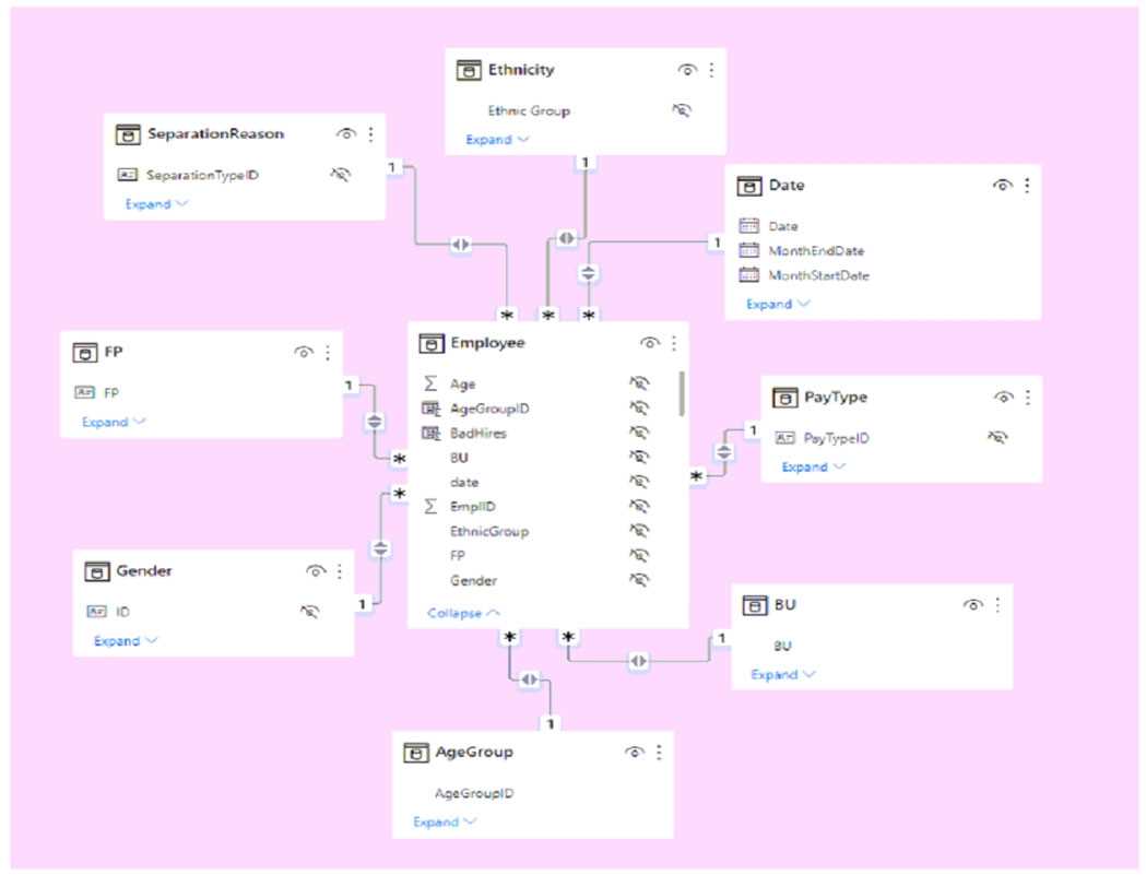
PDF Exam dumpThe Sales table has the following columns.

PDF Exam dumpThe data model must support the following analysis:


โ€ข Total sales by product by month in which the order was placed

โ€ข Quantities sold by product by day on which the order was placed

โ€ข Number of sales transactions by quarter in which the order was placed


For each of the following statements, select Yes if the statement is true. Otherwise, select No.


NOTE: Each correct selection is worth one point.

PDF Exam dump

Show Answer
Correct Answer:

Explanation

The ProductID column is a core dimension required to satisfy the "by product" analysis specified in the requirements. Its removal directly breaks the model's ability to group or filter by product, making Statement 2 False. The LastUpdated column is an audit field and the ShipDate records a different business event than the order placement date, which is the basis for all temporal analysis (month, day, quarter). Since neither LastUpdated nor ShipDate is required for the stated analytical groupings, removing them adheres to the Principle of Minimality in dimensional modeling by reducing model size without sacrificing analytical capability, making Statements 1 and 3 True.

References

Kimball, R., Ross, M. (2013). The Data Warehouse Toolkit: The Definitive Guide to Dimensional Modeling (3rd ed.). Wiley. (Chapter 2, "Fact Tables and Dimension Tables" - Section on Fact Table Granularity and necessity of foreign keys for measures).

Microsoft. (n.d.). Design for performance in Power BI (Data reduction techniques). Official Vendor Documentation. (Section on Removing unnecessary columns as a primary method for reducing memory footprint and improving model performance).

Golfarelli, M., & Rizzi, S. (2009). Data Warehouse Design: Modern Principles and Methodologies. McGraw-Hill Education. (Chapter 6, "Designing the Facts" - Principle that fact tables should only include attributes that are measures or foreign keys necessary for the analysis scope).

Chaudhuri, S., & Dayal, U. (1997). An overview of data warehousing and OLAP technology. ACM SIGMOD Record, 26(1), 65-74. (DOI: https://doi.org/10.1145/244341.244355 - Discusses the importance of keeping fact tables lean and focused on the required measures and dimensions for Online Analytical Processing).

Inmon, W. H. (2005). Building the Data Warehouse (4th ed.). Wiley. (Chapter 16, "The Dimensional Modeling Approach" - Confirms that audit columns are often separated or excluded from the core dimensional model to maintain performance and focus on business value data).

Question 31

HOTSPOT

-


You have a Power BI data model that contains a table named Stores. The table has the following columns:


โ€ข Store Name

โ€ข Open Date

โ€ข Status

โ€ข State

โ€ข City


You need to create a calculated column named Active Store Name that meets the following requirements:


โ€ข When the value of the Status column is โ€œAโ€, the value in the Store Name column must be returned.

โ€ข When the value of the Status column is NOT โ€œAโ€, the value in the Store Name column that is prefixed with "Inactive - " must be returned.


How should you complete the DAX expression? To answer, select the appropriate options in the answer area.


NOTE: Each correct selection is worth one point.
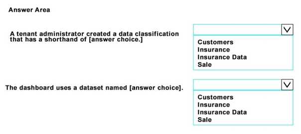
PDF Exam dump
Show Answer
Correct Answer:

Explanation

The first blank requires the IF function, which is appropriate for a simple conditional check with a true and a false outcome. The expression checks the logical condition [Status] = "A". If true, it returns [Store Name]; otherwise, it executes the false part.

The second blank requires the ampersand (&) operator, which is the text concatenation operator in DAX. It joins the string literal "Inactive - " with the value from the [Store Name] column to create a single text string. The && operator is a logical AND, and the + operator is for arithmetic addition, making both incorrect for this purpose.

References

Microsoft Corporation. (n.d.). IF function (DAX). DAX reference. Retrieved from Microsoft Docs.

Details: The documentation specifies the syntax as IF(, [, ]), which directly matches the required logic for evaluating the [Status] column.

Microsoft Corporation. (n.d.). DAX operators. DAX reference. Retrieved from Microsoft Docs.

Details: The "Text concatenation operators" section explicitly lists the ampersand (&) as the operator used to "Concatenate two text strings." The same document lists && under "Logical operators" for AND operations and + under "Arithmetic operators" for addition.

Question 32

You need to create a Power BI theme that will be used in multiple reports. The theme will include corporate branding for font size, color, and bar chart formatting. What should you do?
Options
A: From Power Bl Desktop, customize the current theme,
B: From power Bl Desktop, use a built in report theme.
C: Create a theme as a JSON file and import the theme into Power Bl Desktop.
D: Create a theme as a PBIVlZ file and import the theme into Power Bl Desktop.
Show Answer
Correct Answer:
Create a theme as a JSON file and import the theme into Power Bl Desktop.
Explanation
To create a reusable theme for multiple Power BI reports, you must define the theme's properties in a JSON (JavaScript Object Notation) file. This file allows for detailed customization of a report's default color palette, font properties, and visual styles, including specific formatting for bar charts. Once created, this JSON file can be easily imported into any Power BI Desktop report, ensuring consistent application of corporate branding standards across the organization.
Why Incorrect Options are Wrong

A. Customizing the current theme only applies changes to the single, active report. It does not create a reusable file for other reports.

B. Using a built-in theme does not meet the requirement for custom corporate branding, as these themes are pre-defined by Microsoft.

D. A PBIVIZ file is the package format for a custom visual, not a report theme. It is used to add new chart types to Power BI.

References

1. Microsoft Learn. "Use report themes in Power BI Desktop." Microsoft Docs. This document states, "You can use report themes to apply a design to your entire report... The most basic type of theme file is a JSON file... To use a theme file, you select it by using the Browse for themes option." (Section: "Use a custom report theme")

2. Microsoft Learn. "Power BI report theme JSON file format." Microsoft Docs. This page provides the detailed schema for creating a theme file. It specifies how to define properties for colors, fonts, and visual styles, stating, "At its most basic level, the theme JSON file has only one required line: name." It then details how to customize visualStyles for specific visuals like a barChart. (Section: "Report theme JSON file schema")

Question 33

You have a Power Bl report named Report1 and a dashboard named Dashboard1, Report1 contains a line chart named Sales by month. You pin the Sales by month visual to Dashboard1. In Report1, you change the Sales by month visual to a bar chart. You need to ensure that bar chart displays on Dashboard1. What should you do?
Options
A: Edit the details for the dashboard tile of Dashboard1.
B: Select Refresh visuals for Dashboard1.
C: the Sales by month bar chart to Dashboard1
D: Refresh the dataset used by Report1 and Dashboard1.
Show Answer
Correct Answer:
the Sales by month bar chart to Dashboard1
Explanation
When a visual from a Power BI report is pinned to a dashboard, it creates a tile that is a snapshot of the visual at that moment. Subsequent changes to the visual's type (e.g., from a line chart to a bar chart) in the source report are not automatically reflected on the dashboard tile. The tile will continue to refresh its data, but its visual configuration remains unchanged. To display the new bar chart on the dashboard, you must pin the updated visual from the report, which will create a new tile.
Why Incorrect Options are Wrong

A. Edit the details for the dashboard tile of Dashboard1.

Editing tile details allows for changes to the title, subtitle, and link, but it does not allow you to change the underlying visual type of the tile itself.

B. Select Refresh visuals for Dashboard1.

This action forces a data refresh for the tiles on the dashboard. It updates the data displayed but does not update the visual's type or formatting from the source report.

D. Refresh the dataset used by Report1 and Dashboard1.

Refreshing the dataset updates the underlying data for all associated reports and dashboard tiles. This will not change the visual type of an already pinned tile.

References

1. Microsoft Learn. (2023). Pin a tile to a Power BI dashboard from a report.

Section: "Pin a tile from a report"

Content: "If you change the visualization in the report after you pin it, the dashboard tile doesn't change. For example, if you pin a line chart and then change it to a bar chart in the report, the dashboard tile remains a line chart. The data in the tile refreshes, but the visualization type doesn't. To see the bar chart on the dashboard, pin it to the dashboard as well." This directly supports the correct answer (C) and explains why the other options are incorrect.

2. Microsoft Learn. (2023). Introduction to dashboards for Power BI designers.

Section: "Dashboards versus reports"

Content: This document clarifies the distinction, noting that a dashboard is a single canvas with tiles and that tiles are snapshots of visuals pinned from reports. This foundational concept explains why a change in the report doesn't automatically propagate to the dashboard's visual structure.

Question 34

You have a Power BI report named Report' and a dashboard named Dashboard'. Report1 contains a line chart named Sales by month. You pin the Sales by month visual to Dashboard1. In Report1, you change the Sales by month visual to a bar chart. You need to ensure that the bar chart displays on Dashboard', What should you do?
Options
A: Refresh the dataset used by Report1 and Dashboard1.
B: Select Refresh visuals for Dashboard1.
C: Edit the details for the dashboard tile Of Dashboar1.
D: Pin the Sales by month bar chart to Dashboard1.
Show Answer
Correct Answer:
Pin the Sales by month bar chart to Dashboard1.
Explanation
When a visual is pinned from a Power BI report to a dashboard, it creates a tile that is a snapshot of the visual at that moment. Subsequent changes to the visual's type in the source report, such as changing a line chart to a bar chart, are not automatically propagated to the dashboard tile. The tile will continue to display the original visual type (a line chart) even though its underlying data will refresh. To reflect the new visual type on the dashboard, you must pin the updated bar chart from the report to the dashboard.
Why Incorrect Options are Wrong

A. Refreshing the dataset updates the data points within the existing tile but does not change the visual's type from a line chart to a bar chart.

B. Refreshing dashboard visuals forces a data query for the tiles but does not alter the visual type that was originally pinned.

C. Editing tile details allows you to modify metadata like the title, subtitle, and hyperlink, but not the fundamental visual type.

References

1. Microsoft Learn. (2023). Introduction to dashboards for Power BI designers.

Section: "Reports versus dashboards"

Reference: The documentation states, "If you change a visual in the report, the dashboard tile doesn't change... For example, if you pin a line chart from a report to a dashboard and then you change the line chart to a bar chart in the report. The dashboard tile continues to show a line chart. The data refreshes, but the visual type does not." This directly confirms that re-pinning is necessary to update the visual type.

2. Microsoft Learn. (2023). Dashboard tiles in Power BI.

Section: "Pin a tile from a report"

Reference: This section explains the pinning process and the relationship between the report visual and the dashboard tile. It implicitly supports the concept that the tile is a separate object whose visual type is fixed at the time of pinning, requiring a new pin action to reflect structural changes from the source report.

Question 35

Note: This question is part of a series of questions that present the same scenario. Each question in the series contains a unique solution that might meet the stated goals. Some question sets might have more than one correct solution, while others might not have a correct solution. After you answer a question in this section, you will NOT be able to return to it. As a result, these questions will not appear in the review screen. From Power Query Editor, you profile the data shown in the following exhibit. PL-300 exam question The IOT ID columns are unique to each row in query. You need to analyze 10T events by the hour and day of the year. The solution must improve dataset performance. Solution: You change the IOT DateTime column to the Date data type. Does this meet the goal?
Options
A: Yes
B: No
Show Answer
Correct Answer:
No
Explanation
The stated goal is to analyze events by the hour and the day of the year, while also improving dataset performance. Changing the IOT DateTime column's data type to Date removes the time component entirely. While this action reduces the column's cardinality and would improve performance, it makes the required hourly analysis impossible. Because the solution fails to meet a critical part of the analytical requirement, it does not meet the overall goal.
Why Incorrect Options are Wrong

A. Yes: This is incorrect. The solution prevents analysis by the hour because converting the column to a Date data type discards all time-related information.

References

1. Microsoft Learn. (2023). Data types in Power BI Desktop. "Date - Represents just a Date (no time portion)." This official documentation confirms that the Date data type does not store time information, making hourly analysis impossible after the proposed conversion. Retrieved from https://learn.microsoft.com/en-us/power-bi/connect-data/desktop-data-types

2. Microsoft Learn. (2023). Optimization guide for Power BI. Under the section "Data model optimization techniques," the guidance discusses reducing column cardinality to improve performance. It states, "The VertiPaq storage engine...achieves better compression for columns with lower cardinality." A DateTime column has very high cardinality. Converting it to Date reduces cardinality, which addresses the performance goal, but it fails the analytical goal. Retrieved from https://learn.microsoft.com/en-us/power-bi/guidance/power-bi-optimization#reduce-column-cardinality

3. Microsoft Learn. (2023). Add a date or time column in Power Query. This document shows the correct procedure for this scenario, which involves adding new columns for specific date or time parts (like Hour) from an existing DateTime column, rather than changing the data type of the source column and losing information. Retrieved from https://learn.microsoft.com/en-us/power-query/add-date-time-column

Shopping Cart
Scroll to Top

FLASH OFFER

Days
Hours
Minutes
Seconds

avail $6 DISCOUNT on YOUR PURCHASE